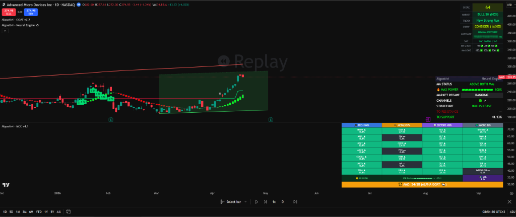
How to Actually Read a Trading Indicator (Not Guess at One)
You added the indicator. It's on your chart. There are numbers, colors, lines, labels, zones, and a dashboard that looks like a cockpit. Now what?
This is the moment most traders quietly give up on an indicator — not because the tool is bad, but because nobody taught them how to actually read it. They see data and feel overwhelmed. They see numbers and don't know which ones matter. They see colors and treat them like traffic lights: green means go, red means stop. That's not reading an indicator. That's guessing with extra steps.
This guide teaches you a structured reading approach that works with any composite TradingView indicator — one that turns visual chaos into a clear decision sequence. No prior experience required. No advanced math. Just the reading hierarchy that separates informed traders from reactive ones.
Reading TradingView indicators means understanding what each element measures, why it matters for your trade, and when to act on it. Most traders add indicators without understanding any of these three. The fix is a top-down reading sequence: start with the composite score, then check the phase, then levels, then regime, then relative strength, then exit pressure. Follow that order and you'll never feel lost on a chart again.
Table of Contents
The Dashboard Problem
Modern TradingView indicators are not like the RSI you learned about in a YouTube tutorial. They don't show one line bouncing between two levels. Instead, they display 10, 15, sometimes 20+ data points simultaneously — composite scores, trend labels, momentum phases, volatility readings, support/resistance levels, regime classifications, relative strength tables, and exit conditions. All on one overlay. All updating every candle.
The problem isn't that these indicators show too much data. The data is there because you need it. The problem is that without a reading hierarchy, you default to scanning randomly — your eyes jump from the score to the trendline to the label to the table and back to the score, and you end up making the same confused, gut-based decisions you were making without the indicator.
Think about how a pilot reads a cockpit. They don't look at every gauge in random order. They follow a scan pattern — a practiced sequence that prioritizes the most critical instruments first, then flows to secondary and tertiary readings. An altitude warning overrides an oil temperature check. A heading deviation overrides a fuel flow reading. There's a hierarchy.
Your indicator dashboard works the same way. The solution is not to simplify the display down to a single green/red arrow (that's removing edge, not adding clarity). The solution is to learn the reading sequence: read top-down, not randomly. Once you have that sequence, a 20-element dashboard becomes a 6-step checklist. And checklists are something any trader can follow.
The 4 Categories Every Indicator Measures
Before you read any specific element on your chart, you need to understand the four fundamental things indicators measure. Every data point on every TradingView indicator falls into one or more of these categories. When you know which category a reading belongs to, you instantly know what question it's answering.
Trend
Question: "Which direction?"
Is price moving up, down, or sideways? Trend readings include moving average direction, structure labels (HH/HL, LH/LL), and regime classifications like "Bull Trend" or "Bear Breakdown." This is always your first filter: if the trend is against you, everything else is noise.
Momentum
Question: "How fast?"
How quickly is price moving in that direction? Momentum tells you whether a trend is accelerating, cruising, or fading. RSI, MACD histograms, and composite score velocity are all momentum readings. A trend can exist with zero momentum — that's a warning sign.
Volatility
Question: "How much energy?"
How wide are the price swings? Volatility tells you whether the market is compressed (coiling for a move) or expanded (already moving). Bollinger Band width, ATR, and squeeze readings are volatility measurements. Low volatility precedes big moves. High volatility precedes exhaustion.
Volume
Question: "How much conviction?"
Is real money behind this move, or is it a low-participation drift? Volume confirms intent. A breakout with volume is a breakout. A breakout without volume is a trap. Volume-weighted readings, on-balance volume, and money flow indicators all measure conviction.
Here's the practical payoff of knowing these four categories: when you see a number on your indicator and you're not sure what it means, ask yourself which of the four it answers. If it tells you direction, it's a trend reading. If it tells you speed, it's momentum. If it tells you range width, it's volatility. If it tells you participation, it's volume.
Why This Matters for Composite Indicators
A composite indicator like the GOAT Toolkit measures all four categories simultaneously and synthesizes them into a single score. That's why it shows so many data points — it's not bloat, it's coverage. Each element contributes to one of the four dimensions. Understanding the category tells you why each reading exists and when to prioritize it. You don't need to check volatility in a strong trend with high momentum. You don't need to check volume in a confirmed squeeze. Context determines which category matters most right now.
How to Read a Composite Score
The composite score is the single most important number on a modern TradingView indicator. It takes all four categories — trend, momentum, volatility, and volume — and compresses them into a single 0 to 100 reading. This is your starting point. Always.
What the Number Means
The composite score is not a prediction. It's a real-time measurement of how many bullish conditions are active versus bearish conditions. A score of 75 doesn't mean the price will go up — it means that right now, 75% of the measured conditions (trend alignment, momentum direction, volume confirmation, volatility expansion, etc.) are skewing bullish.
| Score Range | Classification | What It Means | Action Bias |
|---|---|---|---|
| 0 – 20 | Strongly Bearish | Nearly all conditions are bearish. Active downtrend with momentum. | Short bias only. No long entries. |
| 20 – 40 | Bearish | Majority of conditions lean bearish. Trend is down but may be weakening. | Shorts favored. Watch for reversal setup if rising. |
| 40 – 60 | Neutral / Transitional | Conditions are mixed. Market is deciding. No clear edge either way. | Reduce size or stay flat. Wait for clarity. |
| 60 – 80 | Bullish | Majority of conditions lean bullish. Trend is up with supporting momentum. | Longs favored. Watch for overextension. |
| 80 – 100 | Strongly Bullish | Nearly all conditions are bullish. Strong trend with full confirmation. | Full long bias. Trail stops, don't chase. |
Why the Number Alone Isn't Enough: The Phase
Here's the critical part most traders miss: two identical scores can mean completely different things. A score of 72 that was 55 yesterday is rising — bullish conditions are building. A score of 72 that was 88 yesterday is falling — bullish conditions are deteriorating. Same number. Opposite implications.
This is why you need to read the phase, not just the score. The phase tells you whether the score is:
Rising
Conditions are improving. Bullish momentum is building. This is where entries have the highest probability.
Peaking
Score is at or near a local maximum. Conditions are fully extended. This is where you manage positions, not open new ones.
Falling
Conditions are deteriorating. Regardless of the absolute score, a falling phase means reduced conviction. Tighten or exit.
Bottoming
Score is at or near a local minimum. Conditions have fully deteriorated but are stabilizing. Watch for reversal signals.
Practical Example
You open a chart and the GOAT Toolkit score reads 68, Rising. This means conditions are bullish and improving. The score has been climbing from a lower base, momentum is building, and the trend is aligning with the score direction. This is a high-probability long environment. Compare that to a score of 68, Falling — same number, but conditions are weakening. What was a strong bull setup two candles ago is now showing cracks. A new entry here carries more risk. The score is the headline. The phase is the story underneath.
How to Read Trendlines and Channels
Trendlines and channels are among the most visible elements on a chart overlay, yet most traders read them incorrectly. They see a line and think "support" or "resistance" in binary terms. But the real value isn't the line itself — it's where price is relative to the line, expressed as a measurable distance.
Auto-Drawn vs. Manual Trendlines
Manual trendlines are subjective. Two traders can draw completely different trendlines on the same chart and both feel correct. Auto-drawn trendlines eliminate this ambiguity by using algorithmic pivot detection — they connect mathematically validated swing points rather than visual approximations. This makes them consistent and repeatable, which is essential for systematic decision-making.
When reading auto-drawn trendlines on an indicator like the GOAT Toolkit, pay attention to three things:
1. Position relative to the line. Is price above or below the trendline? Above a rising trendline = trending with support intact. Below it = support has broken, the trend structure is damaged.
2. Distance to the line (percentage). If price is 0.3% above support, you're at the level with tight risk. If price is 8% above support, you're extended — a pullback to the line is more likely than continued extension. The percentage distance functions as a built-in risk filter.
3. Slope of the line. A steep trendline means aggressive movement that's hard to sustain. A shallow trendline means a measured, sustainable trend. When a steep trendline breaks, the correction is usually sharp. When a shallow trendline breaks, the transition is usually gradual.
Market Regime Labels
Advanced indicators classify the current market into a regime based on how price interacts with trendlines, channels, and volatility bands. This label tells you what type of market you're in, which determines which strategies work and which ones will destroy your account.
| Regime Label | What It Means | Strategy Implications |
|---|---|---|
| Bull Breakout | Price has broken above resistance/channel with momentum. New trend leg initiating. | Trend-following. Add on pullbacks. Wide stops. |
| Bull Trend | Established uptrend. Price making higher highs and higher lows within a channel. | Buy dips to support. Trail stops along trendline. |
| Ranging | No directional bias. Price oscillating between defined support and resistance. | Mean reversion. Fade extremes. Tight targets. |
| Squeeze | Volatility compressed to extremes. Channel narrowing. Big move imminent, direction unknown. | Wait for breakout direction. Prepare both scenarios. Size up when confirmed. |
| Bear Breakdown | Price has broken below support/channel with momentum. Downtrend leg initiating. | Short bias. Sell rallies. No bottom-picking. |
| Bear Trend | Established downtrend. Price making lower highs and lower lows. | Sell bounces to resistance. Trail stops down. |
The regime label is not a trade signal — it's a strategy selector. Knowing the regime tells you which playbook to use. Trend-following in a ranging market loses money. Mean reversion in a breakout loses money. The regime label prevents you from applying the wrong strategy to the right chart.
How to Read a Relative Strength Dashboard
Most traders analyze assets in isolation. They look at a chart, evaluate its indicators, and decide whether to buy or sell. But markets don't exist in isolation. Every asset competes with every other asset for capital. Relative strength tells you how your asset is performing compared to everything else — and that context changes everything.
What "Outperforming 25/28 Assets" Means
When a relative strength dashboard shows that your asset is outperforming 25 out of 28 tracked assets, it means your asset's composite score, trend strength, or momentum is stronger than 25 of the assets in the comparison group. This is a ranking, not just a reading.
Why does this matter for your trade? Two reasons:
Capital flows to strength. Institutional money rotates toward the strongest-performing assets. If your asset ranks in the top quartile, it's attracting inflows. Top-ranked assets tend to stay strong longer than traders expect — momentum begets momentum until it exhausts.
Opportunity cost is real. Even if your asset has a decent score of 65, if 20 other assets have scores above 75, your capital is in the wrong place. Relative strength helps you allocate to the highest-probability setups across your entire watchlist, not just the chart you happen to have open.
How to Spot Sector Rotation
Sector rotation is when capital shifts from one group of assets to another. In equities, it might be money moving from tech to energy. In crypto, it might be capital rotating from large-caps to mid-caps. In forex, it might be a shift from risk-on currencies (AUD, NZD) to safe havens (JPY, CHF).
A relative strength dashboard reveals rotation in real time. When you see an entire sector's rankings dropping while another sector's rankings are rising, that's rotation in progress. The practical application: don't fight the rotation. If your sector is weakening relative to the market, even the best individual chart in that sector is swimming against the current.
The Squeeze Reactor: COILING, BULLISH, BEARISH States
The MCC Reactor within the AlgoatTV suite provides a multi-asset squeeze detection system. Each asset in the dashboard is classified into one of three states, and understanding these states is essential for timing:
COILING
Volatility is compressing. The asset is winding up for a move, but direction is unclear. This is the preparation phase. Position sizing should be small, and you should have plans for both breakout directions. The longer the coil, the more explosive the eventual breakout.
BULLISH
The squeeze has resolved to the upside. Volatility is expanding with bullish momentum. This is confirmation that the coil broke in the buyers' favor. This is where you execute long entries with conviction — the uncertainty of the coiling phase is over.
BEARISH
The squeeze has resolved to the downside. Volatility is expanding with bearish momentum. This confirms a downside resolution. Short entries are high-probability here, and any longs should be exited immediately regardless of other readings.
The key insight: the transition from COILING to BULLISH or BEARISH is the highest-conviction moment. This is when the stored energy of compression gets released. If the composite score, phase, and relative strength ranking all align with the squeeze resolution direction, you have a multi-factor confluence setup — the kind that produces outsized moves.
How to Read Exit Pressure
Exit pressure is the most overlooked reading on a composite indicator dashboard — and arguably the most important one for risk management. While the composite score tells you how many bullish or bearish conditions are active, exit pressure measures something entirely different: the intensity of selling activity independent of the overall score.
Think of it this way: the score tells you the overall health of a trend. Exit pressure tells you whether someone is quietly heading for the door. The trend can be healthy and the score can be high while large participants are starting to take profits. By the time the score reflects that selling, the move is well underway.
The Score + Pressure Matrix
The relationship between the composite score and exit pressure creates four scenarios, each with a different implication for your position:
| Score | Exit Pressure | Interpretation | Action |
|---|---|---|---|
| High (70+) | Low | Strong trend, no selling pressure. Clean bullish environment. | Hold longs. Trail stops loosely. Add on dips. |
| High (70+) | Rising | Trend looks strong but smart money is selling into it. Distribution phase. | Tighten stops. Do NOT add. Prepare to exit. |
| Low (30–) | High | Bearish trend with active selling. Full downside momentum. | Stay short or stay out. No bottom-picking. |
| Low (30–) | Falling | Bearish conditions, but selling is exhausting. Sellers are stepping back. | Watch for reversal. Close shorts. Prepare long watchlist. |
The Critical Trap: High Score + Rising Exit Pressure
This is the combination that catches the most traders off guard. Everything looks bullish — the score is high, the trend is up, the chart pattern looks strong. But exit pressure is climbing. This means institutional participants are distributing (selling into the rally). Retail traders see the high score and buy. Smart money sees the rising pressure and sells to them. By the time the score drops to reflect the selling, the move is already 3-5% underway. Reading exit pressure gives you a 2-3 candle head start on the crowd.
The Complete Reading Sequence
Here it is — the top-down reading sequence that turns a complex indicator dashboard into a structured decision process. Follow these six steps in order, every time, on every chart. The sequence is designed so that each step either confirms or disqualifies the trade before you move to the next step. If a step fails, you stop. No cherry-picking.
Check the Composite Score
What's the number? Above 60 = bullish bias. Below 40 = bearish bias. Between 40–60 = no clear edge, consider staying flat. This gives you your directional filter in under one second.
Read the Phase
Is the score Rising, Peaking, Falling, or Bottoming? A bullish score that's falling is weaker than a bullish score that's rising. The phase tells you if you're early, on time, or late. New entries on a Peaking phase have worse odds than entries on a Rising phase.
Evaluate the Levels
Where is price relative to auto-drawn support and resistance? How far are you from the nearest level? If you're buying and resistance is 0.5% above, your risk/reward is terrible. If support is right below you at 0.3%, your stop is tight and defined. Distance-to-level is your risk filter.
Identify the Regime
What regime label is active? Bull Breakout, Bull Trend, Ranging, Squeeze, Bear Breakdown, or Bear Trend? This tells you which strategy to deploy. Trend-following in a range fails. Mean reversion in a breakout fails. The regime selects your playbook.
Check Relative Strength
How does this asset rank against peers? Is it in the top quartile, or is it lagging while others lead? A bullish setup on a top-ranked asset has significantly higher conviction than the same setup on a bottom-ranked asset. Relative strength confirms you're in the right instrument, not just the right direction.
Assess Exit Pressure
Is exit pressure low, stable, or rising? This is your final safety check. Everything else can look perfect, but if exit pressure is climbing, smart money is leaving. A rising exit pressure on a high score is the single most important warning signal on any indicator dashboard. It means: tighten stops, don't add, and prepare to exit.
Putting It Together
In practice, this six-step sequence takes about 15 seconds once you've done it a few times. Open chart. Score: 74, Rising. Levels: 2.1% above support, 5.8% below resistance. Regime: Bull Trend. Relative strength: rank 4 of 28. Exit pressure: low. That's a textbook long setup with defined risk and multi-factor confirmation. No confusion. No guessing. No staring at the screen for twenty minutes trying to decide what to do.
All Of These Readings. One Overlay.
Composite score, phase, levels, regime, relative strength, and exit pressure — all on a single chart.
7 days free. No credit card required.
Start Free TrialCommon Reading Mistakes
Knowing the reading sequence is half the battle. The other half is recognizing the patterns that pull you off the sequence. These are the mistakes that cost traders the most edge.
Mistake 1: Looking at Everything at Once
Your eyes open the chart, and instantly you're scanning the score, the trendline, the relative strength table, and the exit pressure label simultaneously. Your brain tries to synthesize all of it at once and produces noise, not a decision. The fix is the reading sequence. One element at a time, in order. Each step either confirms or kills the trade. If Step 2 fails, you never reach Step 5. Sequential processing beats parallel overwhelm every time.
Mistake 2: Ignoring Exit Pressure
This is the most expensive mistake on the list. Traders see a high composite score and feel confident. The trend is up, the chart looks strong, the regime says Bull Trend. But exit pressure has been climbing for four candles. That high score is about to roll over. By the time the score drops below 60, price has already moved 3% against you. Exit pressure is a leading indicator of score deterioration — ignoring it turns a manageable pullback into a real loss.
Mistake 3: Reading the Score Without the Phase
A score of 65 in isolation tells you almost nothing actionable. Is it rising from 40? That's a strengthening bull case — great entry territory. Is it falling from 85? That's a deteriorating bull case — terrible entry territory. The absolute number is just the starting point. The phase (direction of change) determines whether that number represents opportunity or risk. Always read both.
Mistake 4: Trading in the Wrong Regime
This is the regime mismatch problem. You're buying breakouts in a ranging market (they all fail). You're fading moves in a trending market (you get run over). You're holding positions through squeezes (you get chopped). Every regime has strategies that work and strategies that don't. If you haven't checked the regime label before entering a trade, you're applying random strategies to structured markets. That's a negative-edge approach disguised as analysis.
Mistake 5: Treating Colors as Signals
Green candle does not mean buy. Red label does not mean sell. Colors on indicator dashboards represent categories and states, not trade signals. A red exit pressure label means selling intensity is elevated — that's a data point, not an instruction. The instruction comes from the reading sequence: score + phase + levels + regime + relative strength + exit pressure, interpreted together. If you're reacting to individual colors, you're not reading the indicator. You're playing a video game.
Frequently Asked Questions
Do I need to understand all 191 inputs to use a composite indicator?
No. The entire point of a composite indicator is that the algorithm processes those 191 inputs and outputs a manageable set of readings: a score, a phase, levels, a regime label, relative strength rankings, and exit pressure. You don't need to understand every input any more than you need to understand every transistor in your phone to make a call. What you need to understand is how to read the outputs — which is exactly what this guide covers. The inputs define the methodology. The outputs define your decisions.
Can I simplify the display if it's too much information?
Most quality TradingView indicators let you toggle individual display elements on and off in the settings panel. If you're starting out, consider displaying only the composite score and the trend/regime label. As you get comfortable reading those two elements, progressively enable the relative strength dashboard, exit pressure, and advanced level markings. The reading sequence still applies regardless of how many elements are visible — you're just reducing visual load while you build fluency with the core readings.
What if the composite score and exit pressure contradict each other?
When the score is high but exit pressure is rising, favor caution. Exit pressure is a leading indicator — it detects selling activity before the composite score reflects it. Think of it like a smoke detector: the fire hasn't reached the main room yet, but there's smoke. You don't ignore the alarm because the room still looks fine. Practically, this means tightening your stops, reducing position size, and not adding to the position until exit pressure stabilizes or declines. The score will catch up to the pressure signal within a few candles.
Which reading matters most?
For entries: the composite score and its phase. These two readings alone tell you the directional bias and whether conditions are improving or deteriorating. For risk management: exit pressure. This is the reading that protects your capital by alerting you to distribution before the score drops. For strategy selection: the regime label. No other reading tells you whether to trend-follow, mean-revert, or sit on your hands. For asset selection: relative strength rankings. Every reading has its role, and the reading sequence ensures you check each one in the right context.
How long does it take to learn the reading sequence?
Most traders report fluency within 1-2 weeks of consistent practice. The sequence itself takes about 15 seconds per chart once memorized. The learning curve isn't in understanding the concepts — this guide covers those. The curve is in building the habit of following the sequence every time, without skipping steps or jumping to conclusions. Use a checklist for the first week. Write the six steps on a sticky note next to your monitor. After 50-100 repetitions, the sequence becomes automatic, and you'll wonder how you ever read a chart without it.
Does this reading approach work with free TradingView indicators?
The four-category framework (trend, momentum, volatility, volume) applies to any indicator. The six-step reading sequence, however, requires an indicator that actually provides all six data points: composite score, phase, levels, regime, relative strength, and exit pressure. Most free indicators show only one or two of these dimensions. You can still apply the underlying principles — always check direction before speed, always check the rate of change, always know the regime — but the complete sequence works best with a composite tool that surfaces all six readings in one place. That's the advantage of an integrated indicator suite.
Score. Phase. Levels. Regime.
Relative Strength. Exit Pressure.
The complete reading sequence, built into one indicator suite.
7-day free trial. No credit card required.
Start Your Free TrialFurther Reading
- Best TradingView Indicators for Beginners: What Actually Works — Pillar Guide
- How to Read Any TradingView Chart in Under 60 Seconds — Pillar Guide
- Smart Money Concepts: The Complete Guide — Pillar Guide