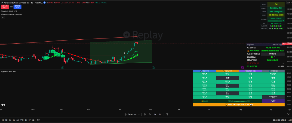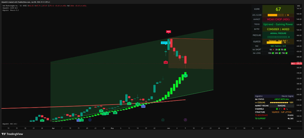
How to Read Any Chart in 10 Seconds — A Systematic Framework
You open a chart. You stare at it. You zoom in. You zoom out. You add an indicator. You remove it. You check another ticker. You come back.
You still don't know the answer to one question:
Should I be in this trade?
This happens 50 times a day.
What if it took 10 seconds instead?
Reading a chart systematically means asking 5 questions in a fixed sequence: (1) What's the health score? (2) What phase is it in? (3) Where are the key levels? (4) Is the broader market favorable? (5) What's the exit pressure? A framework answers all 5 in 10 seconds. If any answer fails, you skip the trade. No ambiguity. No second-guessing. No 15-minute stare-at-the-screen sessions that end with you taking the trade anyway out of boredom. This guide teaches the framework from scratch — universal concepts first, implementation second.
IN THIS GUIDE
Why Most Traders Can't Read a Chart
This is going to sound counterintuitive, but most traders who struggle to read charts don't have a knowledge problem. They have a sequence problem.
They know what RSI is. They understand support and resistance. They can explain moving average crossovers. They've watched 200 hours of YouTube tutorials. And yet, when they open a live chart with real money on the line, they freeze. Or worse — they spend 15 minutes analyzing, form an opinion, see one contradicting signal, doubt themselves, and either take the trade with zero conviction or miss it entirely.
The reason is simple: they're asking the right questions in the wrong order — or skipping the most important ones entirely.
Think about how a doctor reads an X-ray. They don't stare at it and wait for something to "pop out." They follow a protocol. They check specific regions in a specific order. They look for specific pathologies at each step. The entire read takes seconds because the framework eliminates randomness. Trading charts are no different.
Notice what's missing from that entire sequence? There was no check on the broader market. No assessment of whether the asset was leading or lagging its sector. No measurement of exit pressure. The trader answered maybe 2 out of 5 critical questions, spent the entire time on the least important ones (short-term momentum), and never once asked whether the macro environment supported the trade.
This is the structural failure. It's not about which indicators you use or how smart your analysis is. It's about information without hierarchy. When every data point has equal weight, you can't make decisions. You just accumulate more data until you feel "confident enough" — which is another way of saying "until my emotional state tips me in one direction."
⚠ THE CORE PROBLEM
Information without structure equals paralysis. Ten indicators showing conflicting signals don't give you ten opinions — they give you zero actionable intelligence. A framework converts the same information into a binary output: trade or don't trade. The data doesn't change. The architecture of how you process it changes everything.
The fix isn't "get better at reading charts." The fix is to stop "reading charts" entirely and start interrogating them. Five questions. Fixed order. Defined pass/fail criteria. That's what the rest of this guide teaches.
The 5-Question Framework
Every chart analysis should answer exactly five questions, in exactly this order. The sequence is deliberate. Each question acts as a gate — if the answer fails, you stop. You don't proceed to the next question. You don't rationalize. You move to the next ticker.
This is not about being overly conservative. It's about being efficient. If the health score is terrible, checking the levels is a waste of time. If the levels are unfavorable, checking relative strength is irrelevant. Each gate eliminates trades that would fail downstream — saving you time, capital, and emotional energy.
THE 5-GATE DECISION TREE
What's the Health Score?
Composite 0-100 reading. Pass = above 60.
➜ SKIP
What Phase Is It In?
Improving, peaking, or deteriorating. Pass = improving or stable.
➜ SKIP
Where Are the Key Levels?
Support/resistance distance. Pass = favorable risk:reward positioning.
➜ SKIP
Is the Asset Leading or Lagging?
Relative strength vs. peers. Pass = outperforming or in-line.
➜ SKIP
What's the Exit Pressure?
Selling pressure gauge. Pass = low or neutral.
➜ SKIP
✓ ENTER THE TRADE
All 5 gates passed. High-conviction setup.
The order matters because each question builds on the previous one. There's no point in assessing key levels (Question 3) if the health score already told you the asset is in deterioration. There's no point checking relative strength (Question 4) if the risk:reward from the levels is terrible. Each gate eliminates a category of losing trades before you ever waste time on deeper analysis.
Most traders reverse-engineer this. They find a chart that "looks good," form a directional bias, and then cherry-pick the data that supports their bias. The 5-question framework prevents that by forcing you to evaluate data in a sequence that's designed to disqualify bad setups before you get emotionally attached to them.
WHY 5 QUESTIONS, NOT 3 OR 7
Five is the minimum number of independent variables needed to characterize a trade setup. Fewer than five, and you're missing a critical dimension (most traders skip exit pressure and relative strength). More than five, and you introduce redundancy and decision fatigue. These five questions cover: asset health, momentum phase, structural positioning, macro context, and risk. Every trading methodology in existence — whether it's value investing, momentum trading, or smart money concepts — answers some version of these five questions. Most just don't organize them into a sequence.
Now let's break down each question in detail — what it measures, why it's critical, and what constitutes a pass or fail at each gate.
Question 1: What's the Health Score?
The first thing you need when you open any chart is a single number that tells you: is this asset in good shape right now? Not "is it going up." Not "is RSI overbought." A holistic, composite assessment of the asset's current condition — like taking its temperature before doing a full examination.
This is what a health score provides. Instead of reading five separate indicators and mentally synthesizing conflicting signals, a composite score combines trend direction, momentum strength, volume confirmation, and volatility context into a single 0-100 reading. One number. One glance. One answer.
How Composite Scoring Works
A well-designed composite score doesn't just average its inputs. It weights them dynamically based on market conditions. In a trending market, trend alignment gets more weight. In a volatile, choppy market, volatility compression signals get more weight. This is the fundamental difference between a composite score and stacking RSI + MACD + Stochastic on a chart — the composite resolves conflicts internally before presenting you with a result.
Consider the difference:
WITHOUT COMPOSITE SCORING
RSI: 72 — overbought signal
MACD: bullish cross — buy signal
Stochastic: 85 — overbought signal
Volume: declining — bearish signal
MA alignment: bullish — buy signal
Result: 3 say buy, 2 say sell. Decision? Paralysis.
WITH COMPOSITE SCORING
Health Score: 74
Phase: Improving
Result: Above 60 threshold. Phase improving. Gate passed.
Same chart. Same data. Same candles. The only difference is architecture. One approach gives you five conflicting opinions and forces your emotional brain to be the tiebreaker. The other gives you one number with a clear threshold.
What "Above 60" Actually Means
A health score of 60+ on a 0-100 scale indicates that the majority of underlying factors — trend, momentum, volume, volatility — are aligned in the same direction. It doesn't mean the trade will work. It means the setup has structural integrity. Below 60, you have misalignment — some factors are bullish while others are bearish, creating a high-risk, low-conviction scenario.
Here's a practical breakdown of the score ranges:
Phase Classification: The Hidden Dimension
A score of 74 means something very different depending on whether it was 65 last period or 82 last period. In the first case, the score is improving — conditions are getting better. In the second case, the score is deteriorating — conditions are weakening even though the absolute number still looks healthy.
This is phase classification: not just where the score is, but where it's going. A system that only tells you "74" without telling you the trajectory is giving you half the picture. The best entries happen when the score is above 60 and improving. The worst entries happen when the score is above 60 but deteriorating — you're buying a setup that's already peaked and is rolling over.
↗
Improving
Score rising. Momentum building. Best window for new entries. This is the acceleration phase.
→
Peaking
Score high but flattening. Momentum stalling. Hold if already in. Don't open new positions.
↘
Deteriorating
Score falling. Even if still above 60, conditions are weakening. Reduce exposure. Tighten stops.
Implementation: The GOAT Toolkit provides this as its core feature — a composite 0-100 score with phase classification built in. The score synthesizes trend, momentum, volume, and volatility data into a single overlay. But even if you're building your own system, the principle is universal: your first gate should always be a single number that tells you whether conditions are favorable, and which direction the conditions are moving.
Gate 1 pass criteria: Score above 60 AND phase is improving or stable. If the score is below 60 or the phase is deteriorating, stop here. Move to the next ticker. Don't proceed to Question 2.
Question 2: Where Are the Key Levels?
The health score told you the asset is in good shape. Now you need to know: where on the map is price sitting? Because even a perfectly healthy asset is a terrible trade if it's sitting 1% below major resistance with 15% of open air to the downside.
Key levels — support, resistance, trendlines, and channel boundaries — are the structural skeleton of every chart. They tell you where price has historically reacted, where buyers and sellers are concentrated, and most importantly, they define your risk:reward ratio before you enter.
The Three Types of Levels That Matter
Not all levels are created equal. Three categories drive the vast majority of price reactions:
Why Auto-Computed Levels Beat Hand-Drawn Ones
Here's a hard truth: most hand-drawn support and resistance levels are wrong. Not because the trader lacks skill, but because humans are biased toward seeing patterns that confirm their thesis. You're long AAPL, so you draw a support line slightly below the current price to justify your position. You're bearish on BTC, so you draw resistance slightly above to validate your short.
Auto-computed levels eliminate this bias. An algorithm doesn't have a position. It doesn't care if the levels are bullish or bearish. It identifies where price has actually reacted historically — using swing point detection, volume clustering, and fractal analysis — and draws the levels objectively. Same data, zero bias.
This is especially critical for trendlines, which are notoriously subjective when drawn by hand. Two traders looking at the same chart will draw two different trendlines connecting different swing points. An algorithm uses mathematical criteria to identify the highest-confidence trendlines — the ones with the most touches and the tightest fit.
The Distance Metric: Measuring Your Risk:Reward
Once you know where the levels are, the critical calculation is simple: how far is price from the nearest support versus the nearest resistance? This gives you an instant risk:reward assessment.
That last scenario is where most beginners get destroyed. The chart "looks good" — strong trend, bullish momentum, green candles — but price is sitting right below a major resistance level. The health score might be 80. The phase might be improving. But the structural positioning makes the trade suicidal. You're risking 15% for 1% of upside. No amount of momentum can fix that math.
Implementation: The Neural Engine provides auto-computed trendlines using algorithmic swing detection, removing the subjectivity of hand-drawn analysis. Combined with the GOAT Toolkit's 7 moving averages (including the 730-period institutional MA), you get a complete structural map without drawing a single line manually.
Gate 2 pass criteria: Price is closer to support than resistance (favorable R:R). Minimum 2:1 reward-to-risk ratio based on level distances. If price is jammed against resistance with no room to run, stop here. The health score doesn't matter when the structure is working against you.
Question 3: What's the Market Regime?
A health score of 70 in a bull breakout and a health score of 70 in a ranging, choppy market are completely different setups with completely different probabilities. The number is the same. The context is not.
Market regime — the overarching condition of the market you're trading in — changes how you interpret every other signal. It's the difference between swimming with the current and swimming against it. A good setup in a favorable regime is a high-probability trade. The same setup in an adverse regime is a coin flip at best.
The Four Regimes
Markets exist in one of four states at any given time. Each state has different rules for how you trade within it:
▲ Bullish Trend
Higher highs, higher lows. Price above rising moving averages. Momentum confirming direction. In this regime, buy-the-dip strategies work. Breakouts have follow-through. A health score of 70 here has a high probability of continuation.
Strategy: Trade in the direction of the trend. Buy pullbacks to support. Let winners run.
▼ Bearish Trend
Lower highs, lower lows. Price below falling moving averages. Momentum confirming downside. In this regime, rallies are selling opportunities. Breakdowns accelerate. A health score of 70 on an individual stock in a bearish market is suspect — it's likely a dead-cat bounce.
Strategy: Avoid longs or trade with extreme caution. Short rallies to resistance. Protect capital.
↔ Range-Bound
Price oscillating between defined support and resistance. No sustained directional movement. Moving averages flattening. In this regime, breakout strategies fail because every "breakout" is a fake-out. Mean-reversion works better — buy at the bottom of the range, sell at the top.
Strategy: Trade the range boundaries. Don't chase breakouts. Reduce position sizes.
★ Squeeze / Compression
Volatility contracting to extreme lows. Bollinger Bands narrowing. Volume drying up. This is the calm before the storm. A squeeze doesn't tell you direction — it tells you that a large move is imminent. The breakout from a squeeze tends to be violent, high-volume, and sustained.
Strategy: Prepare for a breakout in either direction. Wait for confirmation. Once it fires, trade aggressively.
Why Regime Changes Everything
The single biggest mistake intermediate traders make is applying trending-market strategies in ranging markets (and vice versa). They see a breakout above resistance in a range-bound market and chase it, only to watch it reverse. They see a dip in a bearish market and buy it, only to catch a falling knife.
Regime awareness is what separates traders who are consistently profitable from those who swing between wins and losses. It's not about predicting direction — it's about knowing which type of market you're in so you can apply the appropriate strategy.
A practical way to think about it: regime is the weather, and your trade setup is the outfit. A great outfit worn in the wrong weather is still a bad choice. A sundress in a blizzard. Rain boots on a beach. It doesn't matter how well-constructed the outfit is if the conditions don't support it.
Implementation: The Neural Engine's 10-stage momentum classification maps directly to regime detection. Its smoothed Heikin-Ashi candles filter out the noise that makes regime identification difficult on standard candle charts. The MCC Reactor adds macro-level regime context by showing you whether the broader asset class (not just your individual ticker) is in a trending or consolidating state.
Gate 3 pass criteria: Regime is favorable for your trade direction. Bullish trend or squeeze breakout for longs. Bearish trend for shorts. If the regime is range-bound, only take trades at range extremes with tight stops. If the regime actively contradicts your direction, stop here.
Question 4: Is the Asset Leading or Lagging?
This is the question most retail traders never ask. They analyze a stock in isolation, see a great setup, enter the trade, and then watch it underperform even as the market rallies. Why? Because they bought a laggard in a sector that was already rotating out.
Relative strength — how an asset performs compared to its peers and its benchmark — is one of the most powerful filters in trading. An asset with a health score of 70 that is also outperforming 90% of its peers is a fundamentally different opportunity than an asset with a health score of 70 that is lagging behind its sector.
The Sector Trap
Here's a scenario that destroys accounts: You find a tech stock with strong momentum, improving health score, and a clean breakout above resistance. You buy it. The next day, the tech sector rotates — money flows from tech into energy. Your "strong" tech stock drops 5% even though there's nothing wrong with the company. You didn't trade the stock. You unknowingly traded the sector — and the sector moved against you.
Relative strength analysis prevents this by answering: Is this asset strong because it's genuinely leading, or is it just riding the wave of a strong sector that's about to turn?
The 28-Asset Comparison Concept
Checking relative strength manually is tedious. You'd need to pull up charts of the asset, its sector ETF, the benchmark index, and multiple peers, then visually compare performance. Even then, you'd be comparing based on gut feel rather than objective data.
A cross-asset scanner solves this by ranking assets against each other in real-time. By comparing 28 assets simultaneously across the same metrics, you can instantly see which assets are leading (strongest relative performance), which are lagging (weakest), and which are in the middle of the pack. This converts a subjective visual comparison into an objective ranking.
The number 28 isn't arbitrary — it's enough to capture the major players in a sector or market without being so large that the comparison becomes noisy. In crypto, 28 assets covers the top by market cap plus key layer-1s and DeFi tokens. In equities, 28 covers the mega-caps in a sector plus key mid-caps. In forex, 28 covers all major and cross pairs.
Implementation: The MCC Reactor is built specifically for this. It scans 28 assets simultaneously, ranking them by relative strength in real-time. Instead of checking 28 individual charts, you see a single heatmap that instantly shows which assets are leading and which are lagging. Combined with squeeze detection, it also tells you when an asset's volatility is compressing — signaling an imminent large move.
Gate 4 pass criteria: Asset is in the top half of its peer group (top 14 out of 28 assets). Ideally in the top quartile (top 7). If the asset is underperforming the majority of its peers, the health score is misleading — you're buying relative weakness. Skip it and look at the assets that are actually leading.
Question 5: What's the Exit Pressure?
This is the question that separates good traders from everyone else. And it's the one that almost nobody asks before entering a trade.
Exit pressure measures the intensity of selling activity relative to buying activity — independent of what the price is doing. This is a critical distinction. Price can be rising while exit pressure is building. That's what happens during distribution: smart money is selling into retail buying, and the chart still looks bullish right up until the moment it collapses.
Why Perfect Entries Fail
Every trader has experienced this: you find a textbook setup. The trend is strong. The levels are clean. The momentum is confirming. You enter. And within hours, the asset reverses and stops you out. The setup was correct. The analysis was sound. So what went wrong?
In many cases, exit pressure was already elevated at the time of entry. The smart money — institutions, market makers, large algorithmic traders — had already begun distributing their positions. They do this gradually, selling into strength so they don't crash the price. By the time their distribution is complete, retail traders are left holding the bag as the price drops.
Exit pressure detection catches this dynamic by measuring signals like:
Exit Pressure as an Independent Gauge
Most indicator systems conflate entry and exit analysis. They use the same tools for both, which creates a blind spot. The same RSI reading that says "buy" on the way up also says "hold" until it reaches "sell" territory — by which point you've given back most of your gains.
Exit pressure should be measured as a separate, independent gauge. It answers a different question than the health score. The health score asks: "Is the setup favorable right now?" Exit pressure asks: "Is selling activity building underneath the surface?" Both can be true simultaneously. The setup can look favorable while distribution is already underway.
When exit pressure is high, even the best setups are compromised. You might get the direction right, but the magnitude of the move will be smaller because selling pressure is absorbing the buying. Or worse — you'll be right for a few candles and then get reversed as the accumulated selling overwhelms the buying.
Implementation: The GOAT Toolkit includes exit pressure as a dedicated gauge within its overlay. This isn't a separate indicator you need to add — it's integrated into the same system that provides the health score. When exit pressure is elevated, the system flags it directly on the chart, giving you a visual warning that the setup may be compromised even though the health score still reads favorably.
Gate 5 pass criteria: Exit pressure is low or neutral. If exit pressure is elevated, the entry is compromised — regardless of how clean the other four gates looked. Wait for exit pressure to subside before entering, or skip the trade entirely. This single filter prevents the majority of "right direction, wrong timing" losses.
THE TRINITY PROTOCOL
All 5 Questions. One Overlay. 10 Seconds.
The GOAT Toolkit (health score + exit pressure), Neural Engine (auto-trendlines + regime), and MCC Reactor (relative strength + squeeze) answer every gate in the framework. Any chart. Any asset. Any timeframe.
Try All 3 Free for 7 Days →No credit card required. Full access. Cancel anytime.
Putting It All Together: Before vs. After
Theory is useless without application. Let's walk through what chart analysis actually looks like with and without the framework — same chart, same data, completely different process and outcome.
The Before: Random Analysis
You open a chart — let's say NVDA on the daily timeframe. Here's how the unstructured approach unfolds:
UNSTRUCTURED ANALYSIS — 12+ MINUTES
0:00 – 2:00 — Open chart, notice price is in an uptrend. Feel bullish. Zoom in to see recent candles. Notice a small pullback. Think "maybe it's a dip to buy."
2:00 – 4:00 — Add RSI. It's at 58 — neither overbought nor oversold. Ambiguous. Add MACD. It's flat. Not helpful. Remove MACD. Add Bollinger Bands. Price is in the middle. Tells you nothing.
4:00 – 7:00 — Switch to 4-hour chart. Things look more bullish here. Switch to weekly. Things look uncertain. Switch back to daily. Draw a support line. Realize you drew it wrong. Redraw it. Not sure which swing low to connect.
7:00 – 10:00 — Look at SPY to check the market. It's also in an uptrend but pulling back. Does that matter? Not sure. Look at QQQ. Similar picture. Check NVDA relative to SMCI. SMCI is doing better. Hmm.
10:00 – 12:00 — Form an opinion: "I think it goes up." Place a buy order. No defined stop-loss level. No defined target. No idea what exit pressure looks like. No idea if this is a leading or lagging asset in its sector.
Result: 12 minutes. Low conviction. 2 out of 5 questions answered. Emotional entry.
The After: Systematic Framework
Same chart. Same NVDA daily. But now with the 5-question framework:
SYSTEMATIC ANALYSIS — 10 SECONDS
Second 1-2: Health Score — 73, improving. ✓ PASS
Second 3-4: Key Levels — 8% to resistance, 3% to support. 2.7:1 R:R. ✓ PASS
Second 5-6: Regime — Bullish trend. 10-stage momentum at stage 7 (acceleration). ✓ PASS
Second 7-8: Relative Strength — Ranking 5th out of 28 in tech. Leading. ✓ PASS
Second 9-10: Exit Pressure — Low. No divergence signals. ✓ PASS
Result: 10 seconds. All 5 gates passed. High-conviction entry with defined levels.
Notice the differences. The unstructured approach spent 12 minutes, answered 2 questions, and produced a low-conviction trade based on "I think it goes up." The framework approach took 10 seconds, answered all 5 questions, and produced a trade with quantified risk:reward, confirmed macro alignment, verified relative strength, and low exit pressure.
But here's the more important scenario — when the framework stops you from trading:
FRAMEWORK STOPS THE TRADE AT GATE 2
Gate 1: Health Score — 71, stable. ✓ PASS
Gate 2: Key Levels — 1.5% to resistance, 12% to support. 0.13:1 R:R. ✗ FAIL
Result: STOP. Don't check gates 3-5. Don't enter. Move to next ticker. Time saved: 10+ minutes. Capital saved: potentially a lot.
This is the real power of the framework. It's not about the trades it lets you take — it's about the trades it prevents. Without the framework, that second scenario would have resulted in an entry. The chart "looked good." The health score was 71. But the structural positioning made the risk:reward terrible. The framework caught it in 4 seconds and saved you from a losing trade.
The 10-Second Checklist
Here is the condensed version of the entire framework. Print it. Screenshot it. Tape it to your monitor. Run every single chart through these five gates in this exact order before entering any trade.
10-SECOND CHART READ CHECKLIST
Health Score > 60?
Composite score indicates favorable alignment of trend, momentum, volume, and volatility.
Phase improving or stable?
Score trajectory is upward or flat. Not deteriorating.
Favorable level positioning? (R:R ≥ 2:1)
More room to resistance than to support. Not jammed against a ceiling.
Regime favorable?
Market regime supports your trade direction. Not ranging if trading breakouts.
Asset leading its peers?
Relative strength vs. peer group is above average. Not a laggard riding sector momentum.
Exit pressure low?
No distribution signals. No volume divergence. Selling pressure not building.
ALL ✓ → Enter with conviction.
ANY ✗ → Skip. Move to next ticker.
How to Use This Checklist Daily
The checklist works best when you apply it systematically to a watchlist rather than randomly to whatever chart catches your eye. Start your session by running through your top 10-20 tickers. For each one, ask the 5 questions in order. Stop at the first failure. By the end of 5 minutes, you'll have screened 20 tickers and identified the 2-3 that pass all gates — your high-conviction setups for the day.
This is the opposite of how most traders operate. Instead of starting with one chart and spending 15 minutes convincing yourself it's a trade, you start with 20 charts and spend 10 seconds eliminating the ones that aren't. The framework is a screening tool, not an analysis tool. The analysis is built into the questions themselves.
Over time, this process becomes automatic. You'll glance at a chart and instantly see health score, phase, level positioning, regime, and exit pressure — because you've trained your eyes to look for those five things in that order. The 10-second promise isn't aspirational. It's what actually happens once the framework becomes habitual.
PRO TIP: THE ELIMINATION RATIO
A healthy elimination ratio is 80-90%. If you screen 20 tickers and 15-18 of them fail at least one gate, that's good. It means the framework is doing its job — filtering out setups that lack conviction. If fewer than 10% of your tickers pass all 5 gates, consider whether your watchlist needs updating or whether market conditions are unfavorable for trading altogether. If more than 50% pass, your criteria might be too loose.
Frequently Asked Questions
Read Any Chart in 10 Seconds. Every Time.
Health score. Levels. Regime. Relative strength. Exit pressure. One overlay.
The GOAT Toolkit, Neural Engine, and MCC Reactor answer all 5 questions on every chart, every timeframe, in real-time. The framework you just learned — implemented in three clicks. 7-day free trial. No credit card.
Start Your Free Trial →No credit card. Full access. All three indicators. Cancel anytime.
PILLAR GUIDE
The 3-Indicator System Beginners Actually Need →
PILLAR GUIDE
Smart Money Concepts: The Complete 2026 Guide →
CLUSTER GUIDE
Multi-Timeframe Analysis on TradingView →
⚠ NFA — Not financial advice. Algoat.TV provides educational and analytical tools only. All trading decisions are yours. Trading involves risk of loss. Past performance does not guarantee future results.