The 3-Indicator System Beginners Actually Need
You added RSI. Then MACD. Then Bollinger Bands. Then Ichimoku. Then a volume indicator. Then a momentum oscillator.
Now your chart looks like abstract art and you still can't answer one simple question:
Should I be in this trade?
This guide fixes that. Permanently.
Beginners don't need more indicators — they need fewer, better ones that work together. The ideal system has three layers: one that scores health (is this setup worth trading?), one that maps structure (where are the key levels?), and one that provides macro context (is the broader market favorable?). Three layers. Three decisions. One clear answer. This guide breaks down exactly what each layer does, why you need all three, and how to build a system that replaces the 10 indicators cluttering your chart.
IN THIS GUIDE
The Indicator Overload Problem
Every beginner follows the same arc. You open TradingView, add RSI because a YouTube tutorial told you to, and feel slightly more informed. Then you discover MACD. Then Bollinger Bands. Then Stochastic. Then VWAP. Then some custom indicator with a name like "UltraTrend Pro 5000" that someone on Twitter swore was "the one."
Within two weeks, your chart has more lines than a subway map. And here's the worst part: you're actually making worse decisions than when you started.
This isn't a discipline problem. It's a structural one. Stacking independent indicators creates what psychologists call analysis paralysis — too many inputs, conflicting signals, and no hierarchy to resolve them.
Why Conflicting Signals Destroy Decision-Making
Picture this: RSI reads 72 — overbought, technically a sell signal. But MACD just crossed bullish, which says momentum is building. Bollinger Bands show price touching the upper band, suggesting overextension. But volume is surging, which usually confirms strength.
Four indicators. Four opinions. Two say buy, two say sell. You freeze. Or worse — you pick whichever one confirms the direction you already wanted. That's not analysis. That's confirmation bias with extra steps.
This scenario plays out dozens of times per week for every beginner. And the reason it keeps happening is that these indicators were never designed to work together. They measure overlapping things — RSI and Stochastic both measure momentum; MACD and moving averages both measure trend — but they produce different numbers with different sensitivities.
There's a name for this problem in statistics: multicollinearity. When your inputs are correlated but not identical, adding more of them doesn't increase accuracy. It increases noise. You're not getting five independent opinions. You're getting five slightly different measurements of the same two or three underlying variables — trend and momentum — and they disagree just enough to make you second-guess everything.
⚠ THE REAL COST OF INDICATOR OVERLOAD
Research in behavioral finance consistently shows that increasing information inputs beyond a threshold doesn't improve decision quality — it degrades it. More indicators make you feel more confident in your analysis while actually reducing your accuracy. You mistake complexity for rigor. This is the #1 reason beginners abandon trading within the first year: not because they lack information, but because they have too much of it and no framework to prioritize.
The solution isn't finding one "perfect" indicator. It's finding a system where each component answers a different question and they feed into a single decision. Fewer inputs. Better architecture. One answer: in or out.
What Beginners Actually Need: 3 Layers
Every successful trading system — from Renaissance Technologies running billion-dollar quant models to a day trader consistently pulling profit from ES futures — answers three questions before entering a trade. The language differs. The math differs. But the questions are universal:
1
Health
"Is this setup actually good? Is the trend, momentum, volume, and volatility alignment favorable — or am I forcing a trade?"
2
Structure
"Where are the levels that matter? Where should I enter, where should I exit, and where does the thesis break?"
3
Context
"Is the broader market working for me or against me? Is my asset leading its sector — or am I buying a laggard in a declining market?"
Most beginners only address question one — and they address it badly, by stacking redundant momentum indicators that all measure the same thing. They never address structure because drawing support and resistance feels subjective. And they never address context because they're too zoomed in on one chart to see the broader picture.
The result? They take trades with decent momentum on assets sitting at resistance in collapsing sectors. The setup "looked good" because RSI confirmed and MACD crossed — but the macro picture was screaming the opposite direction.
THE 3-LAYER PRINCIPLE
A complete trading system needs exactly three layers: Health (is the setup favorable?), Structure (where are the decision levels?), and Context (does the bigger picture agree?). Each layer answers a different question. Each uses different data inputs. And when all three align, you have a trade worth taking. When they don't, you sit on your hands. That's the system. Three checkboxes. No ambiguity.
Let's break down each layer — what it does, why you need it, and what kind of tool fills the role. We'll start with the concept before naming any specific implementation, because understanding the why is more important than knowing the what.
Layer 1: Health Scoring — The Single Number That Replaces 5 Indicators
Here's the dirty secret about RSI, MACD, Stochastic, and most momentum indicators: they all measure variations of the same thing. How fast is price moving relative to where it was recently? They just calculate it differently and display it differently.
RSI compares the average of up-closes to down-closes over 14 periods. MACD subtracts a 26-period exponential moving average from a 12-period one. Stochastic compares the current close to the high-low range. Different formulas, same underlying question: is momentum bullish or bearish?
Now imagine instead of reading five separate gauges that each tell you a fragment of the story, you had one composite number, 0 to 100, that synthesized trend direction, momentum strength, volume confirmation, and volatility regime into a single score.
That's what a health scoring system does. It takes the inputs that RSI, MACD, volume oscillators, and trend indicators each measure individually, weighs them based on their reliability in the current regime, and outputs one number that answers: How healthy is this setup right now?
What a Composite Score Synthesizes
Trend Direction
Is price above or below key moving averages? Is the slope of the trend rising, falling, or flat? Are higher timeframes aligned? A composite score weighs trend direction heavily because trading against the trend is the single most common beginner mistake.
Momentum Strength
How fast is price moving in the trend direction? Is momentum accelerating or decelerating? This is what RSI and MACD measure individually — a composite system uses them as inputs, not outputs. You don't read the RSI number. The system reads it for you and factors it into the score.
Volume Confirmation
Is volume supporting the move, or is price rising on declining volume (a warning sign)? Volume validates conviction. A price move without volume is like a promise without follow-through. The scoring system weighs volume-price divergences automatically.
Volatility Regime
Is the asset in a low-volatility compression (potential breakout ahead) or a high-volatility blow-off (potential reversal)? Bollinger Band width, ATR, and historical volatility all feed this variable. The system adjusts its sensitivity based on the current regime instead of using static thresholds.
Why a Single Number Beats Five Separate Indicators
Think of it like a medical checkup. A doctor doesn't hand you five separate printouts — blood pressure, heart rate, cholesterol, blood oxygen, white blood cell count — and say "here, figure it out." They synthesize the data and give you an assessment: healthy, needs attention, or critical.
A composite scoring system does the same thing for your chart. Instead of you trying to reconcile five conflicting signals, it resolves the conflicts internally using weighted logic and gives you the output: a number from 0 to 100, where anything above 60–70 says "this setup is worth investigating" and anything below 30 says "stay out."
This eliminates analysis paralysis entirely. You're not interpreting. You're reading a score.
IMPLEMENTATION: GOAT TOOLKIT
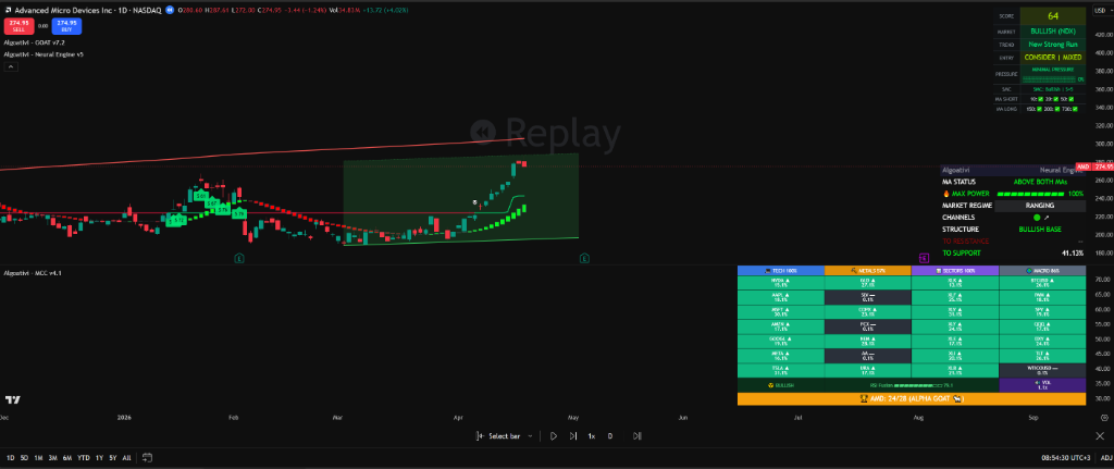
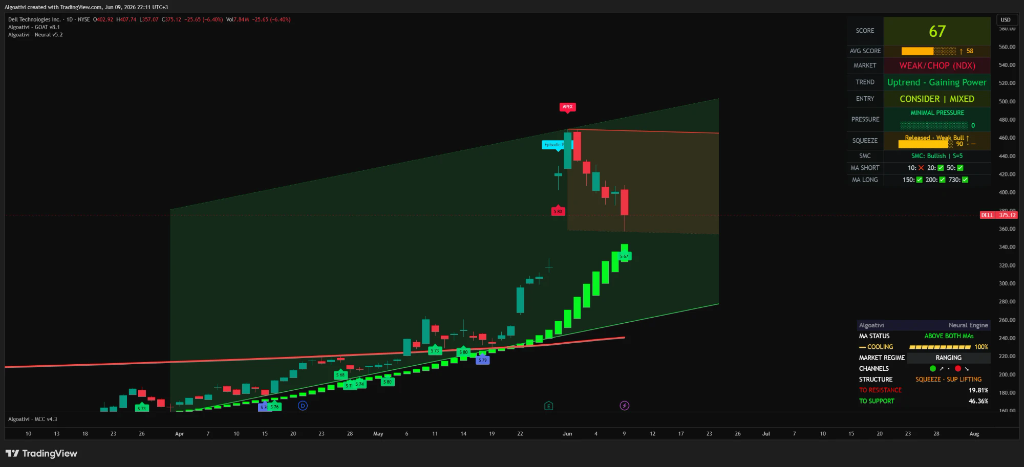
The GOAT Toolkit is our implementation of health scoring on TradingView. It synthesizes trend, momentum, volume, volatility, and Smart Money Concepts (Order Blocks, Fair Value Gaps, Break of Structure) into a single 0–100 composite score. It also includes Exit Pressure detection — an algorithmic signal that warns when a trend is losing steam, even if the score is still elevated. One number. One answer. No interpretation required.
The score updates in real-time on every candle close. You don't need to know what RSI reads. You don't need to check MACD. The Toolkit has already factored them in, along with structural elements that standalone indicators can't see.
Layer 2: Structural Mapping — Levels, Lines, and Regime Classification
Knowing that a setup is healthy is step one. But healthy setups can still fail if you enter at the wrong level. A stock scoring 85 out of 100 doesn't help you if you buy it at a major resistance zone where it's about to get rejected.
This is where structural mapping comes in. It answers the question: where are the levels that matter?
Support, resistance, trendlines, channels, and regime classification aren't optional extras. They're the map. Trading without structure is like navigating a city without knowing where the intersections are. You might be moving in the right direction, but you have no idea when to stop, turn, or accelerate.
The Manual Drawing Problem
Every trading course teaches you to draw support and resistance lines. And in theory, it's straightforward: connect the swing lows for support, connect the swing highs for resistance. Done.
In practice, it's a nightmare for beginners. Which swing points do you connect? The wicks or the bodies? How many touches validate a level? What happens when a line works on the daily chart but is invisible on the 4-hour? You spend 30 minutes drawing lines, then the next candle breaks one, and you redraw everything.
This isn't a learning curve you eventually overcome. Even experienced traders disagree about where to draw lines. Subjectivity is baked into manual structural analysis. The same chart shown to ten traders will produce ten different sets of support and resistance zones.
What Automated Structural Mapping Provides
Auto-Drawn Trendlines
Algorithms identify statistically significant swing points and draw trendlines that connect them using objective criteria — minimum number of touches, minimum angle, maximum deviation. No guessing. No redrawing every session. The lines are calculated, not interpreted.
Dynamic Channels
Price often moves within parallel channels — ascending, descending, or horizontal. An automated system detects these channels and updates them as new data arrives. You can see at a glance whether price is in the middle of a channel (wait), at the top (potential short), or at the bottom (potential long).
Momentum Regime Classification
Markets cycle between trending phases and ranging phases. A structural tool classifies which regime you're in right now. This matters because trend strategies fail in ranges, and range strategies fail in trends. Knowing the regime changes which playbook you use.
Key Level Detection
Not all support and resistance zones are equal. Some have been tested five times and hold every time. Others are minor blips that price slices through. Automated systems rank levels by strength — number of touches, volume at the level, timeframe significance — so you know which ones actually matter.
The real power of structural mapping isn't the individual features. It's the time savings. A beginner spends 30–45 minutes per chart drawing and redrawing lines. An automated system generates the same output in milliseconds, across every asset, on every timeframe, with zero subjectivity.
That time savings compounds. Instead of analyzing three charts per session, you can scan thirty. Instead of second-guessing your lines, you trust the algorithm and focus on the decision: does the structure support the trade?
IMPLEMENTATION: NEURAL ENGINE
The Neural Engine is our structural mapping indicator on TradingView. It auto-draws trendlines and channels using algorithmic swing-point detection, classifies the current momentum regime (trending up, trending down, or ranging), and adapts to any asset and timeframe. No manual drawing. No repainting. The structure updates objectively as new data arrives.
When combined with the GOAT Toolkit's health score, you get a clear picture: "The score says the setup is strong, AND the structure confirms that price is at a high-probability entry level." Or: "The score is decent but price is mid-channel with no structural edge — wait for a better entry."
Layer 3: Macro Context — Why Trading One Chart at a Time Is Blind
You've scored the health. You've mapped the structure. The setup looks perfect on the individual chart. But here's what most beginners never check: is the broader market working for you or against you?
This is the blind spot that kills more trades than bad entries. You buy a tech stock with a strong score and clean structure, but the entire tech sector is rotating out. The S&P 500 is breaking down. The dollar is surging. Your stock might be the strongest name in a collapsing sector — and it still goes down, because macro gravity eventually wins.
Macro context doesn't just improve your trades. It filters out the ones that shouldn't exist.
Relative Strength: The Concept Beginners Ignore
Relative strength isn't RSI (despite the confusing name). Relative strength compares how one asset is performing against another — usually against a benchmark like the S&P 500, its sector ETF, or a basket of correlated assets.
The concept is simple: if the market is going up and your asset is going up faster, it's leading. If the market is going up and your asset is going up slower (or sideways), it's lagging. Leaders tend to continue leading. Laggards tend to continue lagging or break down entirely.
This principle has been validated across decades of market data. William O'Neil built an entire methodology (CANSLIM) around relative strength as a stock selection filter. Momentum factor models at institutional firms use cross-asset relative strength as a primary signal. It works because markets reward winners and punish laggards — and the effect persists over meaningful timeframes.
The Sector Rotation Trap
Here's a scenario that plays out constantly for beginners: you see AAPL forming a nice setup. The chart looks clean. The indicators are bullish. You buy.
What you didn't check: XLK (the tech sector ETF) has been in a steady downtrend for two weeks. Money is rotating from tech into energy. AAPL may be the best house on a bad street, but the entire street is sinking. Your "great setup" decays slowly as the sector rotation pulls even the strongest names down.
A macro context layer prevents this by showing you relative performance across multiple assets simultaneously. Instead of looking at one chart in isolation, you see the entire landscape: which sectors are leading, which are lagging, which assets within each sector have the strongest relative performance. You don't just find a good chart — you find the best chart in the strongest group.
What a Multi-Asset Scanner Provides
Cross-Asset Comparison
See 20–30 assets side by side with their relative strength scores. Instantly identify which are leading, which are lagging, and which are inflecting. Instead of opening 30 charts and scrolling through them, you get a single dashboard view.
Sector and Correlation Awareness
Markets don't move in isolation. Stocks move with their sector. Crypto moves with Bitcoin. Currencies move with interest rate differentials. A macro scanner shows you these correlations so you never unknowingly trade against the dominant flow.
Rotation Detection
When money moves from one sector to another, the scanner detects it before it's obvious on individual charts. You see sector leaders weakening and new leaders emerging. This gives you a head start — you're buying the rising tide while others are still riding the falling one.
IMPLEMENTATION: MCC REACTOR
The MCC Reactor is our 28-asset relative strength scanner on TradingView. It displays a real-time heatmap of relative performance across your chosen universe — stocks, crypto, forex, commodities — showing which assets are leading and which are lagging. It calculates a relative strength score for each asset so you can instantly identify the strongest names in the strongest groups.
When the MCC Reactor shows your asset as a relative strength leader AND the GOAT Toolkit scores it above 70 AND the Neural Engine confirms price is at a structural entry level — you have what we call the Trinity Alignment. All three layers agree. That's when you act.
The 3-Layer Workflow: From Open Chart to Trade Decision
Theory is useless without process. Here's how the three layers combine into a step-by-step workflow that any beginner can follow. Every trade decision runs through the same sequence. No exceptions.
The order matters. Each step acts as a filter. If the asset fails any step, you stop and move on to the next opportunity. This is how you avoid forcing trades — the system says no before your emotions say yes.
CHECK THE SCORE
Is the setup healthy?
Open your chart. Look at the composite health score. Is it above your threshold (e.g., 60 for swing trades, 70 for entries)? If the score is below threshold, stop here. The setup isn't worth investigating further. Move to the next asset. Don't try to "make it work" because the chart pattern looks pretty.
SCORE PASSES ✓ — PROCEED TO STEP 2
CHECK THE STRUCTURE
Is price at a high-probability level?
Look at the structural map. Where are the auto-drawn trendlines and channels? Is price near support (for longs) or resistance (for shorts)? Is the regime trending or ranging? A high health score at mid-channel means "wait for a pullback to structure." A high score at a tested support level means "this is a potential entry." Structure tells you where to act.
STRUCTURE CONFIRMS ✓ — PROCEED TO STEP 3
CHECK THE MACRO
Is the broader market supporting this trade?
Check the relative strength scanner. Is your asset a leader or a laggard compared to its sector and the broader market? Is the sector itself trending in the direction of your trade? If you're buying a stock that's underperforming its sector, and that sector is underperforming the S&P 500, you're swimming against two currents. Skip it.
MACRO CONFIRMS ✓ — PROCEED TO DECISION
ALL THREE LAYERS ALIGN
Now you decide.
Define your entry level (from structure), your stop loss (below the structural support level or above resistance), and your target (next structural level). Calculate your position size based on the distance to stop and your risk percentage. Execute. The three layers gave you conviction. Risk management keeps you in the game.
⚠ THE FILTER PRINCIPLE
The workflow is a funnel, not a checklist. Most assets fail at Step 1 — their health score is below threshold. Of those that pass, many fail at Step 2 — the structure isn't favorable. Of the ones that pass both, some fail at Step 3 — the macro context is working against them. You might scan 50 assets and find 2–3 setups that pass all three filters. That's not a bug — that's the system working. High-quality trades are rare. The 3-layer workflow makes sure you only take the ones worth taking.
THE TRINITY PROTOCOL
All 3 layers on one chart. Health scoring. Structural mapping. Macro context.
The GOAT Toolkit, Neural Engine, and MCC Reactor work together as one system. 7-day free trial. No credit card.
Start Your Free Trial →What About RSI, MACD, and Bollinger Bands?
Let's be clear: RSI, MACD, and Bollinger Bands are not bad indicators. They've been used profitably for decades. The problem isn't the tools themselves — it's how beginners use them.
These classic indicators are components of a scoring system, not standalone decision tools. Think of them as ingredients, not the meal. RSI measures one dimension of momentum. MACD measures trend-momentum convergence. Bollinger Bands measure volatility relative to a moving average. Each one provides a partial signal.
The mistake is reading them individually and treating each one as a buy/sell signal. That's like checking only your tire pressure and deciding your car is ready for a road trip. What about the engine, the brakes, the oil level, the transmission? Each metric tells you something. None of them tells you everything.
Components vs. Decision Tools
Used as Standalone Decision Tools
• "RSI is above 70 — sell!" (ignores trend, volume, structure)
• "MACD just crossed — buy!" (ignores how late the signal is)
• "Price hit upper Bollinger Band — short it!" (ignores trending regimes where price rides the band)
• Each indicator contradicts the others. You pick the one that confirms your bias.
Used as Components of a System
• RSI feeds into the momentum variable of the composite score
• MACD feeds into the trend-momentum convergence variable
• Bollinger width feeds into the volatility regime variable
• The system resolves conflicts internally. You read the output: one score, one direction.
A composite scoring system doesn't eliminate RSI and MACD — it absorbs them. It uses their calculations internally, weighs them against other inputs (volume, trend slope, structural confluences), and produces a single output. You get the benefit of all five indicators without the noise of reading five conflicting signals.
When You Still Might Want Individual Indicators
There are two legitimate use cases for keeping standalone indicators visible on your chart:
1. Learning. If you're still building your understanding of how momentum, trend, and volatility work, watching RSI and MACD in real-time teaches you how they behave. Once you understand what they measure and where they fail, you can graduate to a composite system that uses them internally.
2. Divergence spotting. RSI divergence (price making new highs while RSI makes lower highs) is a genuinely useful warning signal that's easier to see on a standalone RSI panel than within a composite score. Some traders keep a single momentum oscillator visible specifically for divergence analysis, even while using a composite system for everything else.
Beyond these cases, there's no reason to clutter your chart with multiple momentum indicators once you have a system that synthesizes them. Fewer lines. Clearer decisions. That's the whole point.
How to Choose Your First Indicator System
Not all indicator systems are built the same. The TradingView marketplace has thousands of custom indicators, and most of them are just RSI with a different color scheme. Before you commit to any system — ours or anyone else's — run it through this checklist.
Every "yes" is a green flag. Every "no" is a reason to keep looking.
FULL DISCLOSURE
We built the AlgoatTV Trinity — GOAT Toolkit, Neural Engine, MCC Reactor — to pass every item on this checklist. Composite scoring (not display). Exit pressure included. Adapts to any asset. No repainting. Transparent methodology. 7-day free trial, no credit card. But don't take our word for it — use the checklist on every system you evaluate, including ours. The right system is the one that passes for you, on your assets, with your trading style.
Frequently Asked Questions
Replace 10 Indicators With 3 That Actually Work Together
Health scoring. Structural mapping. Macro context. One system.
The GOAT Toolkit, Neural Engine, and MCC Reactor give you the 3-layer workflow on every asset, every timeframe, in real-time. 7-day free trial. No credit card.
Start Your Free Trial →No credit card. Full access. All three indicators. Cancel anytime.
PILLAR GUIDE
Smart Money Concepts: The Complete 2026 Guide →
BEGINNER GUIDE
How to Read Stock Charts: Complete Guide →
TUTORIAL
How to Read TradingView Indicators →
⚠ NFA — Not financial advice. Algoat.TV provides educational and analytical tools only. All trading decisions are yours. Trading involves risk of loss. Past performance does not guarantee future results.