Sector Rotation Explained: How Money Flows Between Markets
You were long tech. The chart looked clean. The score was strong. Your conviction was high.
Then tech went sideways for six weeks while gold rallied 14%, energy surged 11%, and your account flatlined.
Your analysis wasn't wrong. Your timing within the rotation was.
The market didn't stop moving. It moved somewhere else.
What if you could see where the money was going before it got there?
Sector rotation is the natural movement of institutional capital between different market sectors as economic conditions change. Money doesn't enter and exit the market — it rotates between sectors, flowing from tech to commodities, from growth to defensive, from risk-on to risk-off. Traders who understand rotation don't fight these capital flows — they position ahead of them. This guide explains the business cycle framework, risk-on vs. risk-off dynamics, how to detect rotation in real-time across 28 assets, and a practical workflow for trading with the flow instead of against it.
IN THIS GUIDE
What Is Sector Rotation?
Sector rotation is a concept that sounds complicated but is actually simple once you see it: money doesn't enter or exit the market. It moves between sectors. When institutional capital leaves technology, it doesn't go to cash. It flows into energy, commodities, healthcare, bonds, or gold. When it leaves those sectors, it flows somewhere else. The total pool of capital in the market stays roughly constant. What changes is where that capital is deployed.
Think of it like water in a closed system. You have a series of connected pools. When one pool rises, another falls. Nobody is adding or removing water — it's flowing from one basin to the next. The force driving the flow is institutional decision-making: hedge funds, pension funds, sovereign wealth funds, and asset managers reallocating billions based on their economic outlook, risk models, and mandate constraints.
This creates a predictable pattern. In any given market environment, some sectors are absorbing capital (leading) and some are losing capital (lagging). The sectors that lead change as economic conditions shift. The transition between leaders is the rotation itself. And the rotation isn't instantaneous — it unfolds over weeks and months, giving traders who see it early a persistent structural edge.
💡 WHY IT MATTERS FOR YOUR TRADES
A perfect technical setup on a lagging sector will underperform a mediocre setup on a leading one. Sector rotation is the macro filter that determines whether the wind is at your back or in your face. You can fight the rotation and grind out small gains on lagging assets, or you can trade with the rotation and let institutional capital flows amplify your positions. The math compounds dramatically over 6–12 months.
Here's what makes sector rotation different from other market dynamics: it's structural, not random. Rotation follows economic logic. When interest rates rise, banks benefit and growth stocks suffer — that's not opinion, it's accounting. When inflation accelerates, commodity producers see revenue growth while consumer discretionary gets squeezed — that's supply and demand. The patterns repeat because the underlying mechanics repeat. And that repeatability gives you an edge.
The problem isn't that sector rotation is hard to understand. It's that most retail traders never look for it at all. They open their favorite ticker, run their analysis, and trade in isolation. They're oblivious to the fact that the entire sector they're trading is losing institutional capital. They're building sandcastles while the tide goes out. The chart can look bullish for days after the rotation has already begun — because price lags capital flow. By the time the chart confirms the weakness, the move is already half over.
The Business Cycle and Sector Performance
Sector rotation follows the business cycle with remarkable consistency. While no cycle is identical, the general sequence of which sectors lead and lag at each phase has been documented for decades. Understanding this framework gives you a structural map of capital flows — a starting point for knowing where money is likely heading next.
The business cycle has four broad phases. Each phase favors different sectors because each phase creates different economic conditions — different interest rate environments, different inflation dynamics, different consumer behavior, and different corporate earnings profiles. Here's the map:
The table above is a framework, not a calendar. Cycles don't come with timestamps. The transition between phases is gradual and messy. You won't wake up one morning and read a headline that says "expansion officially ended at 3:47 PM yesterday." What you'll see is a slow shift in relative performance: the sectors that were leading start to stall, and the sectors that were lagging start to outperform. That transition period is where most traders get caught — and where rotation-aware traders make their money.
Here's the critical insight: the market rotates before the economy does. Stock markets are forward-looking. By the time GDP data confirms a recession, defensive sectors have already been leading for months. By the time employment data confirms a recovery, cyclical sectors have already rallied 20%+. If you wait for the economic data to confirm the phase, you've missed the rotation. You need to watch the sectors themselves — their relative performance is the leading indicator of the cycle shift.
Why This Matters for Individual Trades
When you take a long position on a tech stock during a late-cycle phase, you're swimming against the current. Institutional capital is flowing out of tech and into energy and commodities. Your individual stock might have a great setup on its own chart, but the aggregate capital flow is working against you. The setup needs to be exceptional just to overcome the headwind. Meanwhile, a mediocre setup on an energy stock during the same phase has the institutional flow at its back. The wind does half the work.
This doesn't mean you can never trade a lagging sector. It means you need to understand the additional risk you're taking. A trade with the rotation has a structural tailwind. A trade against it has a structural headwind. Both can work. But over 100 trades, the rotation-aligned positions will consistently produce better risk-adjusted returns because they have a systematic edge that compounds.
Risk-On vs. Risk-Off Flows
Within the broader business cycle, there's a faster rotation happening constantly: the oscillation between risk-on and risk-off sentiment. This isn't a cycle-level shift — it can happen in days or weeks. And it's the rotation that active traders encounter most frequently.
Risk-on means institutional capital is flowing toward higher-risk, higher-reward assets. Risk-off means it's flowing toward safety and preservation. The shift between these two modes is driven by geopolitical events, economic data releases, central bank decisions, earnings surprises, and shifts in market volatility.
Risk-On (Capital Seeking Growth)
Assets rising: Tech stocks, semiconductors, crypto (BTC, ETH), small caps, consumer discretionary, emerging markets
Assets falling: Bonds (TLT), gold (GLD), utilities (XLU), VIX
Sentiment: Optimistic, growth-oriented
Volatility: Low and declining (VIX below 18)
Risk-Off (Capital Seeking Safety)
Assets rising: Gold (GLD), silver (SLV), bonds (TLT), utilities (XLU), healthcare (XLV), USD, VIX
Assets falling: Tech, crypto, small caps, consumer discretionary, industrials
Sentiment: Fearful, preservation-oriented
Volatility: Rising (VIX above 22, spiking above 30)
The critical concept here is that risk-on and risk-off are not binary states. They exist on a spectrum, and the market can shift gradually or violently. A calm, risk-on market doesn't flip to full risk-off overnight unless there's a geopolitical shock or a credit event. Usually, the transition is gradual: you'll see gold and bonds start strengthening while tech starts to stall. The leading indicators rotate before the lagging ones catch up.
This is where most traders make their biggest rotation mistake: they see tech pulling back and assume it's a "dip to buy." Maybe it is. But if gold, bonds, and utilities are simultaneously strengthening while VIX is climbing, that pullback isn't a dip — it's the beginning of a risk-off rotation. Buying the dip during a rotation is like running toward a building that everyone else is evacuating.
Reading the Cross-Asset Signal
The confirmation of a risk-on or risk-off shift comes from cross-asset agreement. You don't determine the market regime by looking at one chart. You determine it by looking at the relationship between multiple asset classes simultaneously. When tech, crypto, and small caps are all strengthening while bonds, gold, and utilities are weakening, you have broad cross-asset confirmation of risk-on. When the opposite pattern appears, you have risk-off confirmation.
The danger zone is when the signals are mixed — some risk-on assets rising, some risk-off assets also rising. This typically signals a transition period where the rotation is in progress but hasn't completed. During these periods, position sizing should decrease and conviction should be lower. The clarity of the cross-asset signal directly correlates with the probability of follow-through on any individual trade.
How to Detect Rotation in Real-Time
Knowing that rotation exists is the first step. Seeing it happen in real-time is where the edge lives. The challenge is that tracking rotation manually across even 10 assets is cognitively exhausting. Across 28 assets spanning four categories? It's practically impossible without a systematic approach.
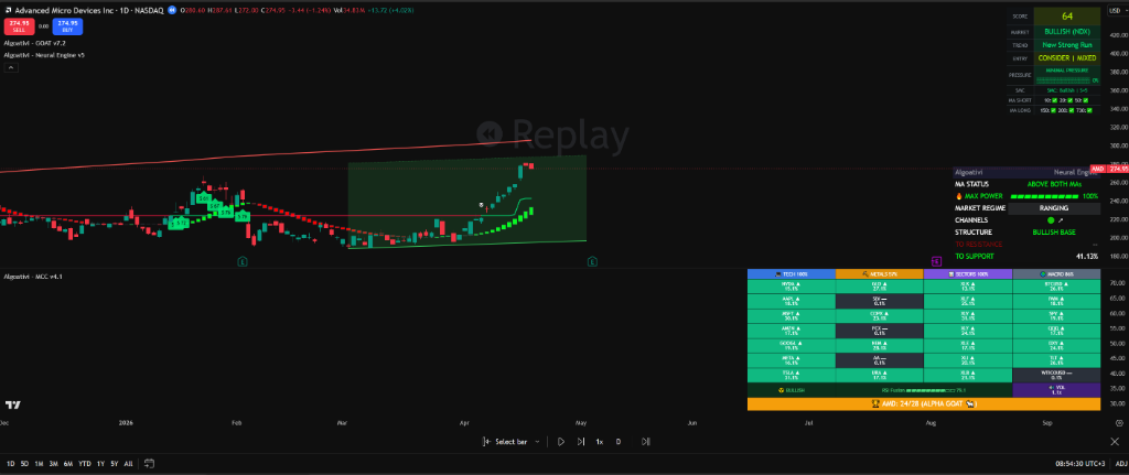
This is the problem the MCC Reactor was designed to solve. It tracks 28 assets across four categories simultaneously, ranking each one by relative strength so you can see the rotation as it unfolds — not after the move is over.
The 28-Asset Universe
The scanner covers four categories, each representing a different segment of the capital flow landscape:
Tech (7 assets)
AAPL, MSFT, NVDA, AMZN, GOOGL, META, AMD — the mega-cap tech names that define risk-on sentiment and growth appetite. When tech leads, the market is in growth mode.
Metals (4 assets)
GLD, SLV, GDX, COPX — precious metals and miners that signal inflation hedging, safe-haven demand, and industrial activity. When metals lead, the market is pricing in uncertainty or commodity demand.
Sectors (10 assets)
XLE, XLF, XLV, XLU, XLI, XLK, XLY, XLP, XLC, XLRE — SPDR sector ETFs covering every corner of the S&P 500. Which sectors are absorbing capital tells you where institutions are positioning.
Macro (7 assets)
SPY, QQQ, DIA, IWM, TLT, BTC, ETH — broad indices, bonds, and crypto. The macro category shows you the highest-level capital flows: equities vs. bonds, large-cap vs. small-cap, traditional vs. digital.
The power of tracking all 28 simultaneously is that you can see rotation between categories, not just within them. If tech is falling from STRONG to NEUTRAL while metals are rising from NEUTRAL to STRONG, that's a cross-category rotation in progress. If all sector ETFs are declining except XLU and XLV (utilities and healthcare), that's a risk-off rotation within equities. If BTC and ETH are leading while SPY and DIA are lagging, capital is rotating from traditional to digital.
What a Rotation Looks Like on the Dashboard
Imagine you open the MCC Reactor on a Monday and see this:
That snapshot tells a complete story without reading a single headline. Gold surged from NEUTRAL to Alpha GOAT. Energy strengthened. Bonds are recovering from WEAK. Meanwhile, NVDA dropped a tier and QQQ fell two tiers. Capital is rotating out of growth/tech and into commodities and defensive assets. This is a risk-off rotation in progress. If you were long QQQ last week, you had the wind at your back. This week, you don't.
That's the power of seeing 28 assets ranked simultaneously. You didn't need to open 28 individual charts. You didn't need to remember what each asset was doing yesterday. The rotation is visible at a glance because the tier changes tell you exactly where capital is flowing and where it's draining.
Rotation Warning Signs
Rotation doesn't announce itself. It starts quietly, then accelerates. But there are specific signals that tell you the flow is shifting before it becomes obvious on the price chart. Here are the warning signs that a rotation is beginning — and that the sector you're currently trading may be losing its edge.
1. Tier Demotion
Your asset drops a tier (e.g., STRONG to NEUTRAL) while other assets in a different category get promoted. This is the earliest and most reliable rotation signal. A single tier drop on one asset is noise. Multiple tier drops across a category while another category gets promoted is a rotation.
2. Diverging Win Rates
If you track your win rate by sector, a declining win rate on your primary sector while win rates hold or improve on other sectors is a rotation signal. The market isn't broken — the opportunity has moved. Your setups are failing not because of bad entries but because the structural tailwind is gone.
3. Defensive Assets Strengthening
When gold (GLD), bonds (TLT), and utilities (XLU) start climbing tiers simultaneously, institutional capital is repositioning for risk-off. This happens before the broader equity indices show weakness. It's the institutional tell: the big money is quietly moving to safety while retail traders are still buying dips.
4. Squeeze Clustering in a New Sector
When multiple assets in the same category enter a volatility squeeze simultaneously, it signals that sector is coiling for a directional move. If tech squeezes are releasing bearish while energy squeezes are releasing bullish, the rotation direction is clear: capital is about to accelerate out of tech and into energy.
5. Leadership Compression
When the spread between the Alpha GOAT and the bottom-ranked asset narrows significantly, it means no sector has clear leadership. This is a transition zone. The old rotation theme has exhausted itself and a new one hasn't emerged yet. Expect elevated choppiness and reduce position sizes until the new leader emerges.
6. Your Best Setup Starts Failing
Every trader has a bread-and-butter setup. When it starts producing smaller wins and more losses in the sector you've been trading — while the same setup pattern appears to work on a different sector — the rotation has already happened. Don't blame the setup. Follow the money and apply it where the flow supports it.
The Costly Denial Pattern
The most expensive response to a rotation is denial. "Tech always comes back." "This dip is a gift." "I know this sector, I'm not switching." These narratives feel like conviction. They're actually anchoring bias. The market doesn't care about your familiarity with a sector. Capital flows where it flows. The traders who adapt to the rotation compound their gains. The ones who fight it compound their frustration.
SEE THE ROTATION BEFORE THE CHART SHOWS IT
28 Assets. 4 Categories. One Dashboard.
The MCC Reactor tracks Tech, Metals, Sectors, and Macro assets simultaneously — ranking them by Ichimoku-based relative strength so you can see where capital is flowing right now.
Try the MCC Reactor Free for 7 Days →Full access to all 28 assets. Cancel anytime.
Trading the Rotation: A Practical Workflow
Understanding sector rotation conceptually is necessary. But it's not sufficient. You need a repeatable workflow that translates rotation awareness into actual trade decisions. Here's a five-step process that converts the MCC Reactor's data into actionable positioning.
Identify the Regime
Open the MCC Reactor and look at the category-level picture first. Which category owns the top tier rankings? If Tech assets dominate Alpha GOAT and STRONG, you're in risk-on/growth mode. If Metals and defensive Sectors lead, you're in risk-off mode. If it's mixed, you're in transition. Don't trade the transition — wait for clarity. The regime determines your bias: which direction you prefer (long vs. short) and which sectors you focus on.
Filter by Tier
Only consider trades on assets ranked Alpha GOAT or STRONG. These are the assets with institutional capital flowing into them. A great technical setup on a WEAK-ranked asset is fighting the current. A decent setup on a STRONG-ranked asset has structural support. Restrict your watchlist to the top-tier assets and ignore everything below NEUTRAL for new long positions. For shorts, flip it: look at WEAK and NEUTRAL assets in declining categories.
Check for Squeeze Alignment
Within your filtered list, check which assets are in a volatility squeeze or have recently released one. A STRONG-ranked asset in a squeeze is coiling for an explosive move in the direction of the rotation. A STRONG-ranked asset with a recent bullish squeeze release is already accelerating. The best rotation trades combine high relative strength with squeeze momentum. This is where the MCC Reactor's squeeze detection across all 28 assets becomes invaluable — you can see which leading assets are about to make their biggest move.
Confirm with the GOAT Score
Once you've identified a STRONG or Alpha GOAT asset with squeeze alignment, open the individual chart and check the GOAT Score. The score gives you the single-chart technical picture: trend direction, momentum, and entry quality. The rotation analysis tells you the asset is in favor. The score tells you the timing is right. Rotation gives you the "what." The score gives you the "when." A high GOAT Score on a leading-tier asset is the highest-probability setup the system produces.
Monitor for Tier Changes
After you enter a position, continue checking the MCC Reactor for tier changes on your asset. If your asset drops from STRONG to NEUTRAL, the rotation tailwind is weakening. That's not necessarily an exit signal, but it should tighten your stops and reduce your conviction on adding to the position. If it drops to WEAK, the rotation has moved against you — consider exiting regardless of what the individual chart shows. The relative strength tier is your macro stop-loss. When the flow shifts, respect it.
☑ WORKFLOW SUMMARY
Regime (risk-on/off) → Tier filter (Alpha GOAT / STRONG only) → Squeeze check (coiling or released?) → GOAT Score (timing confirmation) → Monitor tiers for exit signals. Five steps. No guesswork. Every decision is backed by cross-asset data instead of single-chart hope.
Common Rotation Mistakes
Even traders who understand rotation make predictable errors. These aren't conceptual failures — they're execution failures that come from deeply ingrained habits. Knowing them in advance won't make you immune, but it will help you catch yourself faster.
Chasing the Rotation After It's Over
You notice gold has been on a massive run and jump in at the top. The rotation into commodities happened three weeks ago. The assets that moved from NEUTRAL to Alpha GOAT have already made their biggest percentage gains. Entering now means you're buying the mature phase of the move, not the early phase. The time to enter a rotation trade is when the tier promotion first appears — not when it's been leading for weeks and everyone is talking about it. If the whole market already knows about the rotation, the edge is gone.
Confusing a Pullback with a Rotation
Not every pullback in your sector is a rotation. Tech can drop 4% in a week and still be the leading sector if everything else dropped 6%. A rotation is a relative shift: your sector losing ground while other sectors gain ground. If everything is falling, that's a broad selloff, not a rotation. If everything is rising but your sector is rising less, that's a rotation. Check the cross-asset picture before concluding that a sector pullback means capital is leaving.
Sector Loyalty
You know tech. You trade tech. You're comfortable with tech. So when the rotation moves to energy or metals, you stay in tech because "that's what I understand." This is anchoring bias dressed up as expertise. A rotation-aware trader follows the money, even into unfamiliar sectors. The technical setups look the same on every chart. The candlesticks, the indicators, the price action — it all works the same way whether it's NVDA or XLE. Your edge comes from the process, not from sector-specific knowledge.
Over-Rotating (Whipsawing Yourself)
The opposite of sector loyalty: switching sectors every time the tier rankings change slightly. A one-day tier fluctuation is noise. True rotations develop over days and weeks, not hours. If you rebalance every time a single asset moves from STRONG to NEUTRAL and back, you'll generate commissions and frustration but no alpha. Wait for sustained tier changes across multiple assets in the same category before concluding that a rotation is underway. One asset moving is a signal. Three assets in the same category moving is a rotation.
Ignoring the Transition Period
Between one rotation theme ending and the next beginning, there's a messy transition period where nothing leads clearly. Many traders try to force trades during this phase because they feel like they should always be in the market. This is where accounts get chopped up. When the MCC Reactor shows compressed tier spreads and mixed signals, the correct response is to reduce exposure and wait. The rotation will clarify. Missing one week of the new move costs far less than losing money during the transition.
Frequently Asked Questions
How long does a typical sector rotation last?
Rotation themes typically last 3 to 12 months, though the pace varies based on economic conditions and catalysts. The initial shift (when tiers change on the MCC Reactor) can happen within 1–2 weeks. The profitable phase — where the new leading sector consistently outperforms — usually lasts 2–6 months. By the time mainstream financial media is covering the rotation, it's often in its later stages. The goal is to identify the shift in the first 2 weeks, ride it for months, and exit when the tier rankings start compressing again.
Can I trade sector rotation with a small account?
Absolutely. Sector rotation awareness doesn't require large positions. It's a filter, not a position-sizing rule. Instead of deciding "what should I trade today?", you're deciding "which sector should I focus on today?" Whether you trade with $1,000 or $100,000, the rotation analysis is the same. The difference is that small accounts benefit even more from rotation awareness because they can't afford the opportunity cost of deploying limited capital in a lagging sector. Every dollar counts more when you have fewer of them.
Does sector rotation work for day trading or only swing trading?
Sector rotation is primarily a swing trading and position trading concept because rotations unfold over weeks and months. However, day traders benefit enormously from knowing the rotation regime. If the rotation favors energy, a day trader who focuses their intraday setups on energy stocks will find better follow-through, cleaner trends, and more reliable breakouts than a day trader working on lagging tech names. The rotation doesn't give you intraday entries — but it tells you where the intraday setups are most likely to work.
What happens when all sectors are falling?
When every sector is declining, you're in a broad market selloff, not a rotation. In this environment, the MCC Reactor still provides value: it shows you which sectors are holding up best (declining least). These relative leaders are typically where money will flow first when the selloff ends. They're also the safest short targets if the selloff accelerates — lagging sectors tend to fall fastest during broad liquidation. Additionally, defensive assets like gold and bonds often show relative strength during broad equity selloffs, and the Reactor will surface that clearly.
How is this different from just watching sector ETFs manually?
Watching sector ETFs manually gives you absolute performance: "XLE is up 3% this week." The MCC Reactor gives you relative performance: "XLE is ranked #2 out of 28 assets and climbing." The difference is critical. XLE being up 3% means nothing if everything else is up 5%. Relative ranking tells you whether capital is flowing toward or away from that sector compared to all alternatives. Manual tracking also introduces recency bias, anchoring, and cognitive load that a systematic ranking eliminates. The Reactor compares all 28 simultaneously using the same Ichimoku-based methodology — no bias, no fatigue, no memory errors.
Can sector rotation strategies be backtested?
Yes, and the results are well-documented across academic and institutional research. Strategies that systematically overweight top-performing sectors and underweight bottom-performing sectors have shown persistent alpha over decades of data. The specific methodology matters — simple price-momentum rotation strategies are vulnerable to whipsaws during transitions. The Ichimoku-based relative strength approach used in the MCC Reactor adds structural depth because it doesn't just measure price change, it assesses multi-dimensional trend positioning. That extra depth helps avoid the false rotation signals that trip up simpler momentum strategies.
STOP TRADING AGAINST THE FLOW
See Where Capital Is Rotating — Before the Chart Confirms It
The MCC Reactor ranks 28 assets across Tech, Metals, Sectors, and Macro in real-time. Ichimoku-based relative strength. Squeeze detection. Full rotation visibility.
Trade with the institutional flow. Not against it.
Start Your 7-Day Free Trial →Full access to GOAT Score, MCC Reactor, and Exit Pressure. Cancel anytime.
CONTINUE READING
How Relative Strength Scanning Changes Everything
The full guide to why comparing 28 assets beats analyzing one chart in isolation.
CLUSTER GUIDEThe Volatility Squeeze Explained
Bollinger + Keltner compression and the directional release that follows.
PILLAR GUIDEHow to Read Any Chart in 10 Seconds
The 5-question framework that turns analysis into a binary decision.
PILLAR GUIDEThe Exit System That Fixes Bag-Holding
Exit pressure + ATR trailing stops: a complete framework for knowing when to leave.
This content is educational and does not constitute financial advice. Trading involves risk, and past performance does not guarantee future results. Always do your own research before making trading decisions.