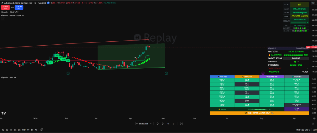
Stop Trading One Chart at a Time — Relative Strength Scanning
You found a great setup. Score looks good. Structure is clean. You enter the trade.
It goes sideways for 3 weeks while everything else in the market rallies 15%.
You weren't wrong about the chart. You were wrong about the chart's context.
You were trading the weakest horse in a stampede.
What if you could see the entire race before placing your bet?
Relative strength measures how your asset performs compared to its peers — not in isolation. A stock can be going up and still be weak if everything else is going up faster. Scanning relative strength across 28 assets simultaneously tells you whether your trade is leading the pack or getting left behind. This guide explains the methodology, why it matters more than any single-chart indicator, and how Ichimoku-based relative positioning across Tech, Metals, Sectors, and Macro assets gives you the full competitive landscape before you risk a single dollar.
IN THIS GUIDE
The Single-Chart Trap
Imagine you're watching a 100-meter sprint, but you can only see one lane. Your runner crosses the finish line in 10.5 seconds. Is that fast? You have no idea. Without seeing the other runners, you can't tell if 10.5 was a dominant performance or dead last. You need the full field to judge the result.
This is exactly what happens when you analyze a single chart in isolation. You open NVDA. It's up 5% this month. The trend looks healthy. The indicators are green. You enter the trade.
What you didn't check: SPY is up 8%. AAPL is up 9%. MSFT is up 7%. AMD is up 11%. BTC is up 12%. Gold is up 6%. Your "winning" ticker is actually underperforming nearly everything in the market. You picked the slowest horse in a stampede and congratulated yourself because it was moving forward.
The single-chart trap isn't about bad analysis. Your analysis might be technically perfect. The trap is that technically perfect analysis of the wrong asset produces worse results than mediocre analysis of the right one. If you spend an hour crafting the perfect entry on a lagging stock while a leading stock in the same sector would've given you 3x the return with the same setup, your analysis skill didn't help you — it hurt you, because it gave you false confidence in an inferior choice.
Every single ticker in that table is green. Every single one looks "good" in isolation. But the spread between the leader and the laggard is 7.4%. Over a month, on a leveraged position, that's the difference between a strong equity curve and a flat one. And that gap compounds.
This is the fundamental problem: your chart is always right about what price is doing, but it's completely silent about what price should be doing relative to the market. A stock rising 5% in a market rising 12% isn't bullish. It's a warning. It means institutional capital is flowing somewhere else, and your ticker is being left behind. The chart won't tell you that. Only a relative strength scanner will.
The Opportunity Cost Nobody Calculates
Every dollar deployed in a lagging asset is a dollar not deployed in a leading one. This sounds obvious in theory, but traders almost never factor opportunity cost into their trade assessment. They evaluate a position by its absolute return: "Am I green or red?" The actual question should be: "Did this dollar earn more here than it would have earned in the strongest available alternative?"
If your position gained 4% and the market leader gained 15%, your position didn't earn 4%. It cost you 11%. That's negative alpha, and it's invisible on your P&L because your account shows a gain. The most dangerous underperformance is the kind that looks like a win.
💡 THE CORE INSIGHT
The single-chart trap isn't a mistake you make once. It's a structural flaw in your workflow. If your process starts with "open a chart and analyze it," you will consistently allocate capital to inferior opportunities because you never compared your asset to the alternatives first. The fix is to reverse the order: scan the field, identify the leaders, then analyze only those. Don't pick the horse and then check the race. Check the race and then pick the horse.
What Is Relative Strength? (It's Not RSI)
Let's clear up the most common confusion in technical analysis: relative strength is not the Relative Strength Index (RSI). These are completely different concepts that unfortunately share a name.
RSI (Relative Strength Index) is a momentum oscillator that measures the speed and magnitude of an asset's own price changes. It oscillates between 0 and 100 and tells you whether an asset is overbought or oversold relative to itself. It's a single-chart metric. It says "this stock has been going up fast relative to its recent history."
Relative Strength (RS) is a comparison metric. It measures how one asset is performing against a basket of other assets. It doesn't care about overbought or oversold. It cares about one question: is this asset outperforming or underperforming its peers? An asset can have an RSI of 70 (overbought) and still have the strongest relative strength in the field — meaning it's leading the pack and capital is flowing into it.
RSI (Relative Strength Index)
Measures: Own price momentum
Compares: Asset to itself (past vs. present)
Output: 0–100 oscillator
Question: "Is it overbought or oversold?"
Relative Strength (RS)
Measures: Performance vs. peers
Compares: Asset to 28 other assets
Output: Rank + tier (Alpha GOAT / STRONG / NEUTRAL / WEAK)
Question: "Is it leading or lagging the field?"
The Ichimoku-Based Methodology
There are multiple ways to calculate relative strength. The simplest is a price ratio: divide Asset A's price by Asset B's price and track the direction. If the ratio rises, Asset A is outperforming. If it falls, Asset A is underperforming. But simple ratios are noisy, single-dimensional, and lag behind trend shifts.
The MCC Reactor uses an Ichimoku-based relative strength methodology because Ichimoku gives you something no other system does: multi-dimensional trend assessment in a single read. Instead of measuring one variable (price ratio), Ichimoku measures the relationship between price, its equilibrium zones, and its forward displacement across multiple timeframes simultaneously.
Here's what that means in practice. For each asset in the scanner, the system calculates:
Cloud Displacement
Where is price relative to the Kumo cloud? Above the cloud = bullish structure. Below = bearish. Inside = indecision. The distance from cloud matters — an asset far above its cloud has stronger structural positioning than one barely above it.
Tenkan/Kijun Ratios
The Tenkan-sen (conversion line) and Kijun-sen (base line) create a dual-speed equilibrium system. When Tenkan is above Kijun, short-term momentum leads long-term balance — bullish. The ratio between them quantifies the strength of that momentum differential.
Chikou Span Position
The lagging span confirms whether current momentum has structural backing from historical price action. If the Chikou span is above past price, the trend has historical clearance — no overhead supply from previous congestion zones.
Cross-Asset Comparison
All of the above is calculated for each of the 28 assets, then compared across the entire basket. The result: a ranked leaderboard where each asset's position reflects its Ichimoku health relative to every other asset in the scan.
The beauty of this approach is that it captures trend health, momentum, and structural positioning simultaneously. A simple price ratio might show two assets performing equally, but Ichimoku-based RS reveals that one is well above its cloud with bullish TK ratios while the other is barely above a thinning cloud with a bearish Chikou span. Same performance. Completely different structural quality.
🔎 WHY ICHIMOKU?
Most relative strength systems use a single ratio (price A / price B). Ichimoku uses five data points per asset, creating a composite picture that captures trend direction, trend strength, momentum speed, equilibrium position, and historical clearance. It's the difference between comparing two runners by their current position versus comparing their stride length, acceleration, fatigue level, and wind resistance simultaneously.
How a 28-Asset Scanner Works
The concept is straightforward: take 28 assets that represent the major segments of the tradable market, calculate each one's Ichimoku-based relative strength, rank them from 1 to 28, and display the result on a single dashboard. You see the entire competitive landscape in one view. No flipping between charts. No manual comparison. No guesswork about what's leading and what's lagging.
But the choice of which 28 assets matters enormously. The scanner isn't 28 random tickers. It's a curated basket designed to represent every major capital flow in the market: growth equities, defensive equities, precious metals, bonds, currencies, and crypto. This gives you full coverage of where institutional money is rotating.
Tech / Growth
NVDA, AAPL, MSFT, AMZN, GOOGL, META, AMD, TSLA
High-beta growth leaders. When tech dominates relative strength, the market is in risk-on mode and capital is chasing innovation and earnings growth.
Precious Metals
GLD, SLV, GDX, PPLT
Safe haven and inflation hedges. When metals lead the scanner, capital is defensive, inflation fears are rising, or real yields are falling.
Sector ETFs
XLK, XLF, XLE, XLV, XLI, XLU, XLRE, XLP
Sector-level flows. Which sectors are attracting capital and which are being abandoned. The sector rotation story in real-time.
Macro / Benchmark
SPY, QQQ, IWM, DXY, TLT, BTC, ETH, UNG
Benchmark indices, dollar strength, bonds, crypto, and commodities. The macro framework that tells you what regime the market is operating in.
The Ranking Tiers: Alpha GOAT to WEAK
The scanner doesn't just rank assets numerically. It classifies each asset into one of four tiers based on where it falls in the ranking. These tiers translate the raw rank into actionable categories that tell you exactly how to treat each asset in your portfolio.
The tier system eliminates the gray zone. You're not staring at a number trying to decide if it's "good enough." You're reading a category that tells you immediately: trade this, consider this, ignore this, or short this. The cognitive load drops to zero.
And because the scanner updates in real-time, you see when an asset is transitioning between tiers. A stock that was STRONG last week and just crossed into Alpha GOAT is an asset with accelerating relative momentum. A stock that was Alpha GOAT and just slipped to NEUTRAL is a warning that institutional capital is rotating away. These transitions are signals in themselves.
Why Relative Strength Matters More Than Absolute Strength
Absolute strength says: "This asset is going up." Relative strength says: "This asset is going up faster than everything else." The distinction sounds subtle. It isn't. It fundamentally changes your risk/reward assessment on every trade.
Consider two assets. Both have a GOAT Score of 70. Both look technically sound. Asset A is ranked 2 out of 28. Asset B is ranked 25 out of 28. Same score. Radically different implications.
Asset A
GOAT Score: 70 · RS Rank: 2 / 28
This asset has strong technicals AND institutional capital flowing in. The score confirms the setup, and the ranking confirms the market agrees. When the market pulls back, this asset will likely hold better than peers (relative strength acts as a cushion). When the market rallies, this asset will likely outperform. You're riding a leader.
Asset B
GOAT Score: 70 · RS Rank: 25 / 28
This asset has strong technicals BUT institutional capital is elsewhere. The score says the chart looks healthy, but the ranking says the market doesn't care. When the market pulls back, this asset will likely drop faster than peers (no institutional support floor). When the market rallies, this asset will underperform. You're trapped in a laggard with a pretty chart.
This is the concept most traders never internalize: the ranking changes your risk/reward assessment even when the score doesn't change. A score of 65 on the number 2 ranked asset has vastly superior expected value compared to a score of 75 on the number 25 ranked asset. The ranking tells you where institutional capital is concentrated, and in a drawdown, capital concentration is the only thing that prevents a position from becoming a casualty.
The Institutional Capital Flow Effect
Large institutions don't flip between assets randomly. They rotate capital deliberately, typically in patterns driven by macro conditions, earnings cycles, and risk appetite. When a sector starts outperforming on the relative strength scanner, it's because institutional allocators are increasing their weighting. They're buying over weeks and months, which creates sustained demand and structural support beneath price.
When you trade the top-ranked assets, you're trading in the same direction as these capital flows. You have a tailwind. When you trade the bottom-ranked assets, you're fighting those flows. Every rally gets sold into because institutional money is leaving. Every dip goes deeper because there's no large buyer providing a floor.
This is why relative strength persistence exists. Academic research consistently shows that assets with strong relative strength tend to continue outperforming over the subsequent 3–12 months. It's not a chart pattern. It's a capital flow phenomenon. Institutional allocation decisions take months to fully execute, which means the relative strength signal today predicts the capital flow for weeks to come.
⚠ THE TRAP TO AVOID
Don't confuse "cheap" with "opportunity." A WEAK-ranked asset that has dropped 30% is not a bargain — it's an asset that institutional capital is actively abandoning. The reason it's cheap is because the largest, most informed participants in the market have decided to sell it. Buying a WEAK-ranked asset because the price looks low is like catching a falling knife and expecting it to become a handle. Wait for relative strength to improve before committing capital.
The Drawdown Shield
One of the most underappreciated benefits of trading high relative strength assets is drawdown behavior. When the overall market corrects, top-ranked assets typically experience shallower drawdowns and faster recoveries. Why? Because the institutional money that pushed them to the top is still committed. Fund managers don't abandon their highest-conviction positions during a routine pullback. They might trim, but they don't liquidate.
Conversely, WEAK-ranked assets during a market correction are the first to get liquidated. They're already out of favor, and the correction gives institutions the excuse to close the position entirely. This creates asymmetric drawdown profiles: leading assets pull back 5% while lagging assets crater 15%. If you're consistently positioned in the top-ranked assets, your maximum drawdown across a correction is structurally smaller. Not because you timed the market, but because you positioned in assets with built-in institutional support.
Sector Rotation: Following the Money
The stock market is not a single entity. It's a collection of sectors, each responding to different economic drivers. Technology responds to growth expectations and interest rates. Energy responds to commodity prices and geopolitical risk. Utilities respond to yield curves and defensive positioning. Financials respond to credit conditions and rate spreads.
At any given moment, some of these sectors are attracting capital while others are losing it. This constant reallocation is called sector rotation, and it follows a broadly predictable cycle tied to economic expansion and contraction. Understanding where you are in the cycle tells you which sectors should be at the top of the relative strength scanner and which should be at the bottom.
The Classic Rotation Cycle
While real markets are messy and cycles never repeat exactly, the general pattern of sector rotation has been consistent enough across decades to serve as a reliable framework. Here's the sequence and what each phase looks like on the relative strength scanner.
Reading Rotation on the Scanner
The power of a 28-asset relative strength scanner is that you don't need to memorize the rotation cycle or guess where you are in it. The scanner shows you. When metals and defensive sectors are climbing from NEUTRAL to STRONG while tech is slipping from STRONG to NEUTRAL, the scanner is telling you that capital is rotating from growth to safety. You're watching the rotation happen in real-time, measured objectively.
The critical insight is the direction of movement within the tiers, not just the current tier. An asset that has been STRONG for six weeks is in a different position than an asset that just moved from WEAK to STRONG last week. The first is established but potentially exhausted. The second is fresh and potentially in the early stage of a sustained rotation.
This is also why the scanner needs to be broad. A narrow scanner — say, just the S&P sectors — would miss the rotation between equities and alternatives. When capital rotates from SPY to GLD to BTC to TLT, a sector-only scanner is completely blind. The 28-asset basket captures rotation across asset classes, not just within them.
The Squeeze Reactor: When Compression Meets Relative Strength
Volatility doesn't disappear. It compresses. And when it compresses enough, it releases — violently, directionally, and with the kind of momentum that creates the best trading opportunities of the month.
A volatility squeeze occurs when Bollinger Bands contract inside Keltner Channels. Normally, Bollinger Bands (which are based on standard deviation) are wider than Keltner Channels (which are based on Average True Range). When volatility drops so low that the Bollinger Bands collapse inside the Keltner Channels, the market is telling you something unambiguous: energy is coiling.
Think of it as a spring being compressed. The tighter the compression, the more violent the release. The squeeze doesn't tell you which direction the release will go — that's where other indicators come in. But it tells you that a directional move is loading, and you should be positioned before it fires.
ANATOMY OF A SQUEEZE
1
Compression
Bollinger Bands move inside Keltner Channels. Volatility drops below historical norms. Price consolidates in a narrowing range. The squeeze dots appear.
2
Release
Bollinger Bands expand back outside Keltner Channels. Volatility surges. Price breaks out of consolidation. The Squeeze Reactor fires directional arrows.
3
Follow-Through
The initial burst creates momentum that typically sustains for multiple sessions. The longer the compression phase, the more powerful the release tends to be.
Squeeze + Relative Strength = The Explosive Setup
A squeeze on its own is useful. A squeeze on a top-ranked relative strength asset is a category killer. Here's why the combination is so powerful:
When an Alpha GOAT or STRONG-ranked asset enters a squeeze, you know two things simultaneously. First, institutional capital is already concentrated in this asset (that's why it's top-ranked). Second, the asset's volatility has compressed to a point where a directional release is imminent. This means you have large buyers already committed to the position AND a volatility event about to unfold. When the squeeze fires in the bullish direction on a top-ranked asset, the institutional capital already in the trade acts as accelerant fuel for the breakout.
Contrast this with a squeeze on a WEAK-ranked asset. The volatility compression might release upward, but without institutional capital supporting the move, the breakout often fails. There's no committed buying base to sustain the momentum. The squeeze fires, price jumps for a day or two, and then fades right back into the range because the large players aren't participating.
High-Probability Squeeze
RS Rank: Top 10 · Squeeze Firing ↑
Institutional backing + volatility release = sustained breakout with follow-through momentum. The move sticks.
Low-Probability Squeeze
RS Rank: Bottom 10 · Squeeze Firing ↑
No institutional support + volatility release = short-lived pop that fades. Dead cat bounce masquerading as a breakout.
RSI Fusion: The Confirmation Layer
The MCC Reactor also includes RSI Fusion, a hybrid RSI that blends three calculations: Classic RSI (Wilder's original 14-period), True RSI (using True Range instead of close-to-close changes for more accurate measurement of actual price movement), and Adaptive RSI (which adjusts its sensitivity based on market conditions).
By combining all three, RSI Fusion reduces the false signals that any single RSI variant produces. Classic RSI is too slow in trending markets. True RSI is too volatile in choppy markets. Adaptive RSI is great in transitions but can over-adapt. The fusion smooths these weaknesses across conditions, giving you a momentum reading you can actually trust as a confirmation layer for your relative strength and squeeze signals.
When all three align — top relative strength rank, squeeze firing directionally, and RSI Fusion confirming momentum — you have a setup with structural, volatility, and momentum confluence. These setups don't appear every day. When they do, they deserve your full attention and your best position sizing.
MCC REACTOR
28 Assets Tracked. One Dashboard.
Relative strength ranking. Squeeze detection. RSI Fusion. See where your ticker ranks before you risk a single dollar.
Start 7-Day Free Trial →No credit card required. Full access to all 3 indicators.
How to Use Relative Strength in Your Trading
Understanding relative strength conceptually is step one. Integrating it into your actual trading workflow is where the results happen. Here's the systematic process, from scanner to execution.
The key mental shift: you never start with a ticker anymore. You start with the scanner. The scanner tells you which tickers deserve your attention. Then you apply your analysis tools to those tickers only. This reversal of the traditional workflow is what separates traders who consistently find the best opportunities from those who consistently analyze the wrong ones.
THE RELATIVE STRENGTH WORKFLOW
Open the Scanner — Identify the Leaders
Open the MCC Reactor. Look at the top of the leaderboard. Which assets are ranked Alpha GOAT and STRONG? These are the only tickers you should be analyzing today. Write them down. Everything else gets ignored regardless of what anyone on social media says about it.
Apply the GOAT Score — Filter for Setups
Switch to each top-ranked asset individually and check its GOAT Score. You're looking for assets that are both high-ranked AND have a healthy score (above 60). A top-ranked asset with a low score might be coasting on recent momentum without structural backing. A high score confirms that the relative strength has technical substance.
Check the Squeeze Reactor — Look for Loaded Springs
Among your top-ranked, high-score assets, check if any have an active squeeze. If yes, you have a potential explosive setup: strong relative strength (capital flow), healthy technicals (GOAT Score), and volatility compression (squeeze). This triple confluence is the highest-probability setup in the framework.
Hard Rule: Never Trade WEAK-Ranked Assets
This is the discipline filter. Regardless of how compelling a chart looks, regardless of what the score says, regardless of what you read on Twitter — if an asset is ranked WEAK on the scanner, do not enter the trade. The market is telling you that capital is leaving this asset. Respect the signal. Your next best trade is in the top of the scanner, not the bottom.
When to Override the Scanner
Short answer: rarely. The scanner reflects capital flows. You are not smarter than the aggregate behavior of every institution in the market. If your thesis says an asset should be leading but the scanner says it's lagging, the scanner is telling you something your thesis hasn't accounted for.
The only legitimate override scenario is when you're trading a specific catalyst event (earnings, FDA approval, geopolitical event) where the catalyst's impact hasn't been priced into the relative strength yet. In those cases, the scanner might show the asset as NEUTRAL today, but the catalyst could push it to STRONG tomorrow. Even then, you should be aware that you're taking a higher-risk position than the scanner supports and size accordingly.
💡 THE SIMPLE RULE
If the score and the rank agree, you have a high-confidence trade. If the score is good but the rank is bad, you have a chart that looks healthy but is getting abandoned by institutional capital — proceed with extreme caution. If the rank is good but the score is low, the asset is leading the field but technically extended or in transition — wait for the score to confirm. Never trade when both disagree.
Manual Scanning vs. Automated: The Time Cost of Edge
You can do relative strength scanning manually. Nobody is stopping you from opening 28 charts, comparing them visually, and making a mental ranking. People did this before scanners existed. Some still do.
The question isn't whether it's possible. The question is whether it's optimal. Let's compare the two approaches honestly.
The math is unambiguous. A manual scan of 28 assets takes at minimum 30 minutes if you're being thorough. You need to open each chart, assess its trend, compare it to what you remember from the previous charts, and somehow hold a mental ranking of all 28. By the time you finish, the first charts you analyzed may have already changed. Your "snapshot" is actually a smeared exposure taken over half an hour.
And here's the deeper problem: manual scanning introduces every cognitive bias we discussed earlier. You'll spend more time on charts you already like. You'll anchor to the first asset you checked. You'll underweight assets that are in unfamiliar sectors. You'll overweight assets you have an existing position in. The manual scan doesn't just take longer — it produces a different, worse result because the process itself is contaminated by your psychology.
An automated scanner runs the same calculation on all 28 assets simultaneously, with the same methodology, with zero bias, and displays the result in the time it takes you to glance at the screen. The scan is a point-in-time snapshot, not a 30-minute blurred impression. Every asset is evaluated identically. Your opinion doesn't influence the ranking. The scanner doesn't care which ticker you "like."
💡 THE REAL VALUE PROPOSITION
The scanner doesn't replace your analysis skill. It replaces the worst part of your process: the asset selection step where bias does the most damage. You're still the one who decides entry, exit, and position size. The scanner just makes sure you're applying those skills to the right ticker instead of the wrong one. That single improvement — consistently analyzing the strongest assets instead of random ones — compounds into a completely different equity curve over 12 months.
Frequently Asked Questions
Is relative strength the same as RSI?
No. RSI (Relative Strength Index) measures an asset's own momentum — whether it's overbought or oversold relative to its recent price history. Relative Strength (RS) compares one asset's performance against a basket of other assets. RSI is a single-chart tool. RS is a multi-asset comparison tool. They answer completely different questions. RSI asks "is this asset moving too fast?" RS asks "is this asset leading or lagging the field?"
Can I use relative strength for crypto, not just stocks?
The MCC Reactor scanner includes both BTC and ETH in its 28-asset basket alongside stocks, ETFs, metals, and bonds. This means you can see how crypto ranks against traditional assets in real-time. If BTC is Alpha GOAT and SPY is NEUTRAL, the scanner is telling you that capital is flowing toward crypto and away from traditional equities. The methodology is asset-agnostic — Ichimoku-based relative strength works on any liquid, exchange-traded instrument.
How often should I check the relative strength scanner?
For swing traders (multi-day to multi-week holds), checking the scanner once per day at market open is sufficient. Relative strength tiers don't flip every hour — they reflect sustained capital flows that evolve over days and weeks. For day traders, a check at open and one mid-session is reasonable. Over-checking creates noise. The scanner's value is in showing you the structural landscape, not micro-fluctuations.
What timeframe does the MCC Reactor use for relative strength calculation?
The Ichimoku-based relative strength calculation uses the standard Ichimoku periods (9, 26, 52) which capture short-term momentum, medium-term equilibrium, and long-term trend simultaneously. This multi-timeframe approach means the ranking reflects structural positioning across all three horizons, not just a single lookback period. The result is a ranking that's responsive enough to catch emerging trends but stable enough to filter out daily noise.
Should I short WEAK-ranked assets?
WEAK relative strength confirms that capital is leaving an asset, which makes it a valid candidate for short positions. However, relative strength alone is not a short signal — it's context. You still need a technical setup (breakdown, rejection at resistance, bearish score) to time the entry. Think of WEAK ranking as the pre-qualification: "this is the kind of asset worth shorting." The score and price action give you the timing. The best short setups combine WEAK relative strength with a deteriorating GOAT Score and a squeeze release to the downside.
Can relative strength work in bear markets?
In a bear market, most assets are declining. But they're not all declining at the same rate. Relative strength in a bear market tells you which assets are holding up best (declining least) and which are collapsing fastest. The top-ranked assets during a bear market are often defensive names (utilities, healthcare, gold, bonds) — and these can actually produce positive returns even while the broad market falls. The scanner's value arguably increases in a bear market because the spread between leaders and laggards widens dramatically.
What's the difference between the MCC Reactor and TradingView's built-in screener?
TradingView's built-in screener filters by individual metrics (P/E ratio, volume, RSI, etc.) on single assets. It doesn't rank assets against each other using multi-dimensional relative strength. The MCC Reactor compares 28 assets simultaneously using Ichimoku-based methodology, classifies them into tiers (Alpha GOAT / STRONG / NEUTRAL / WEAK), and overlays squeeze detection and RSI Fusion. It's the difference between filtering a database and ranking a competitive field.
How does the Squeeze Reactor differ from a standard squeeze indicator?
Standard squeeze indicators (like the TTM Squeeze) detect the Bollinger/Keltner compression event but leave the directional interpretation to you. The Squeeze Reactor goes further: it detects the compression, determines the directional bias using momentum analysis, and fires directional arrows when the squeeze releases. Combined with the relative strength ranking, you know not just that a squeeze is firing, but whether it's firing on a leader or a laggard — which dramatically changes the probability of follow-through.
STOP GUESSING. START SCANNING.
See the Full Field Before You Trade
The MCC Reactor ranks 28 assets in real-time using Ichimoku-based relative strength, detects volatility squeezes, and fuses three RSI variants into one actionable signal.
One dashboard. Full market context. No more trading blind.
Start Your 7-Day Free Trial →Full access to GOAT Score, MCC Reactor, and Exit Pressure. Cancel anytime.
CONTINUE READING
Sector Rotation Trading Strategy
How capital rotates through sectors and how to position ahead of the flow.
CLUSTER GUIDEThe Volatility Squeeze Explained
Bollinger + Keltner compression and the directional release that follows.
PILLAR GUIDEHow to Read Any Chart in 10 Seconds
The 5-question framework that turns analysis into a binary decision.
PILLAR GUIDEThe Exit System That Fixes Bag-Holding
Exit pressure + ATR trailing stops: a complete framework for knowing when to leave.
This content is educational and does not constitute financial advice. Trading involves risk, and past performance does not guarantee future results. Always do your own research before making trading decisions.